SenseTime
3D redesign of an AI educational application
UX Design Intern
May - Nov 2020
User Experience Design Team, Tanya Zhang (Manager)
Overview
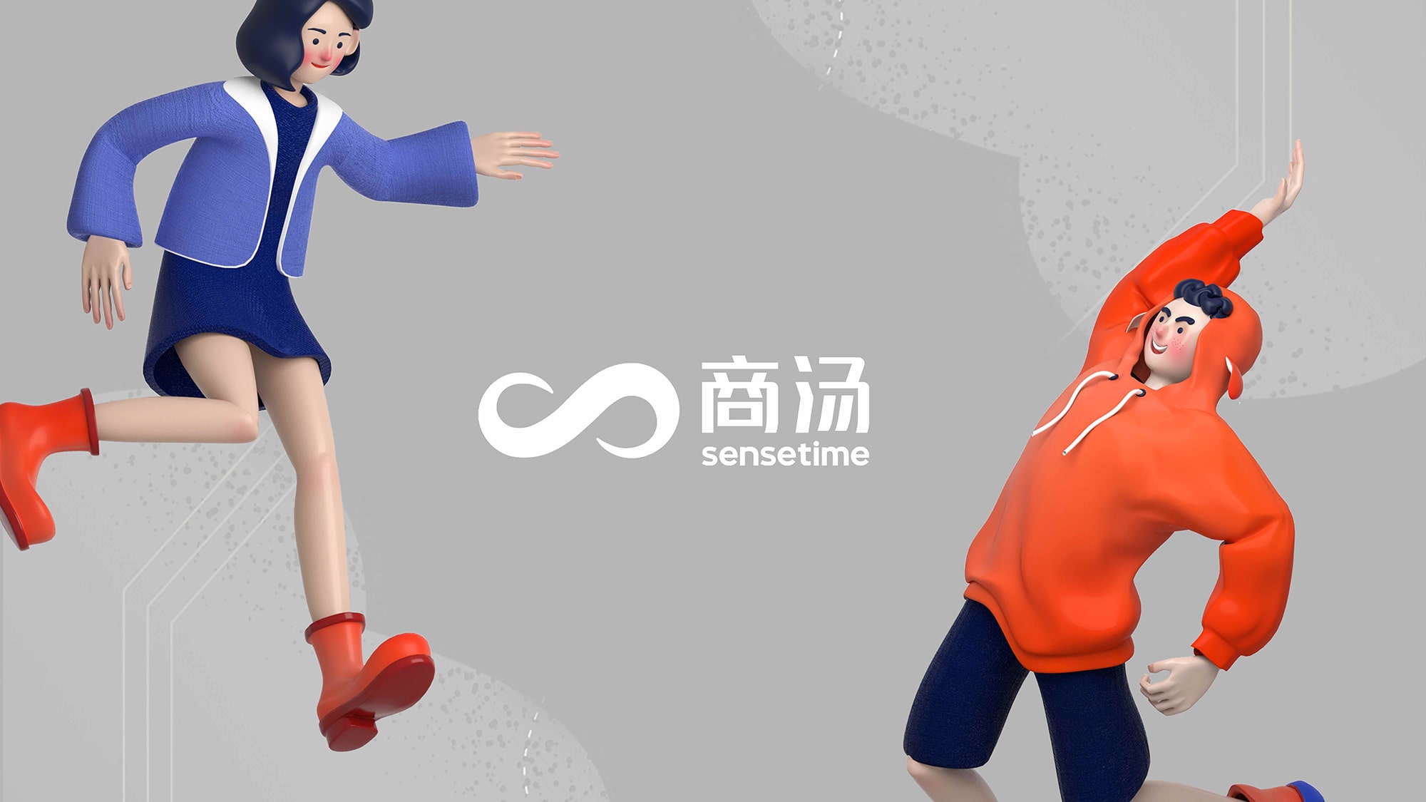
During my gap semester in 2020, I was a UX Design intern for SenseTime in Shanghai, China. SenseTime is an AI unicorn specializing in computer vision and facial recognition, with a current valuation of $12 billion.
As part of the User Experience Design team, I developed 3D brand characters and UI for the Education website (shown in this case study) and created the UI/UX for the Smart Community web app SenseSpace (under NDA).
SenseStudy
AI educational application
Problem
Objective
Outcome
135K+
students
250+
schools
Q3 2020
product launched!
3D Character Design
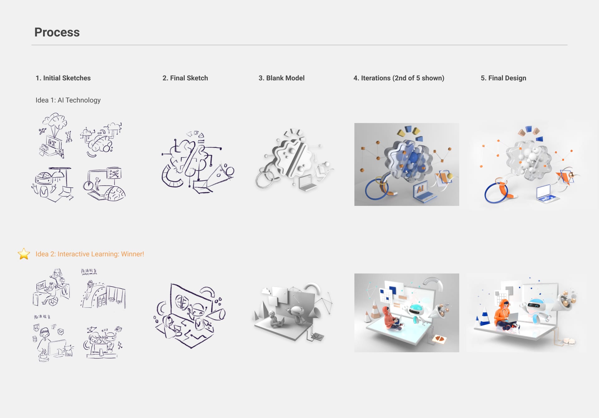
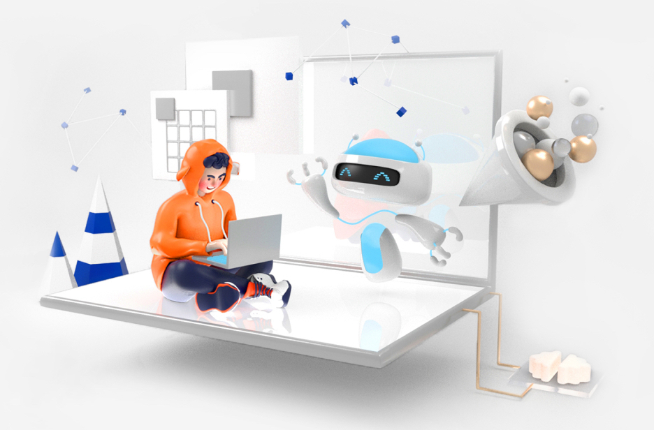
Based on the 2D line designs created by my colleague, I developed five characters from scratch. It was my most challenging 3D design project and a strenuous process of modeling, shading, rigging, skinning, and rendering.


Explore Page Redesign
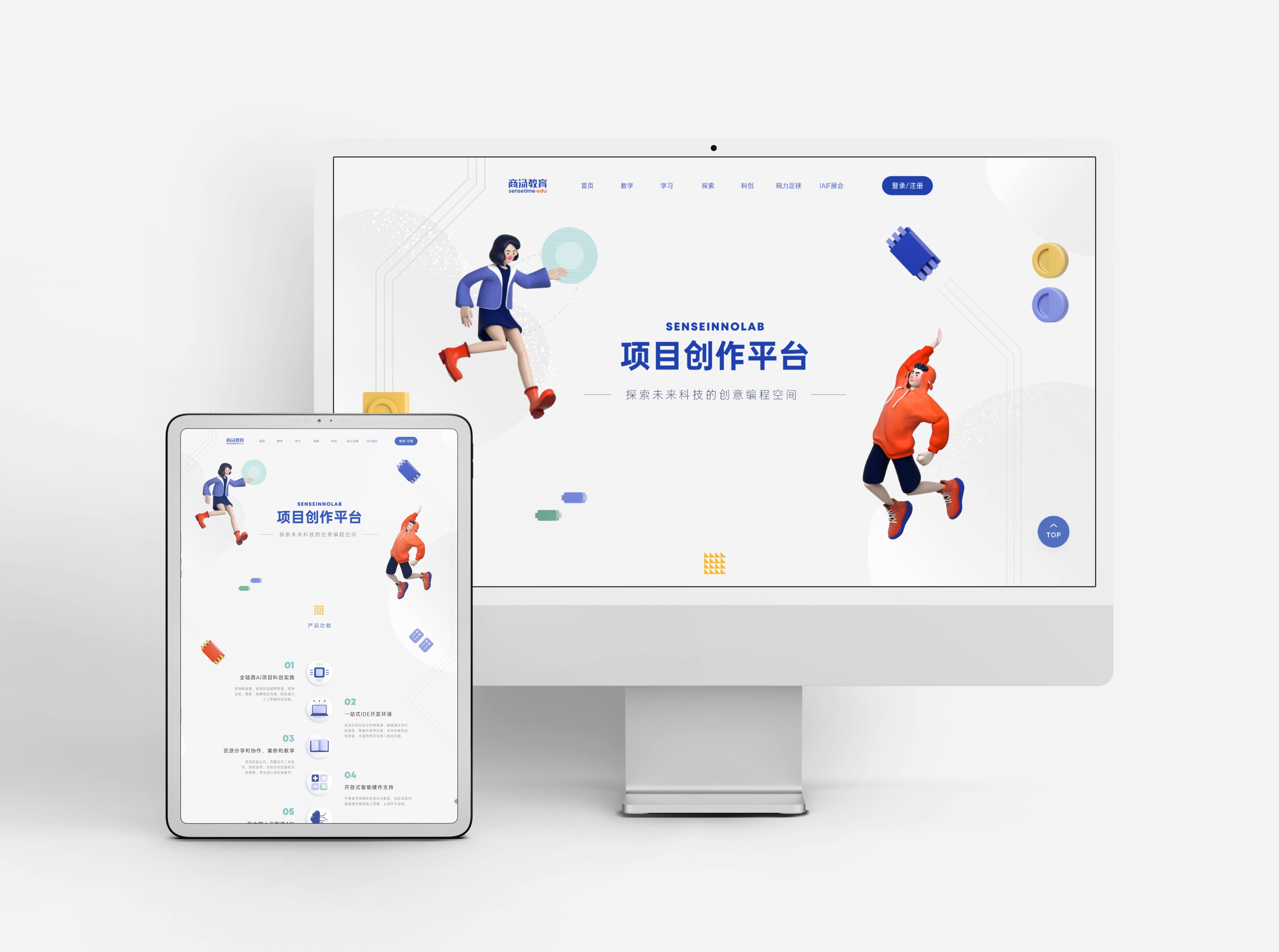
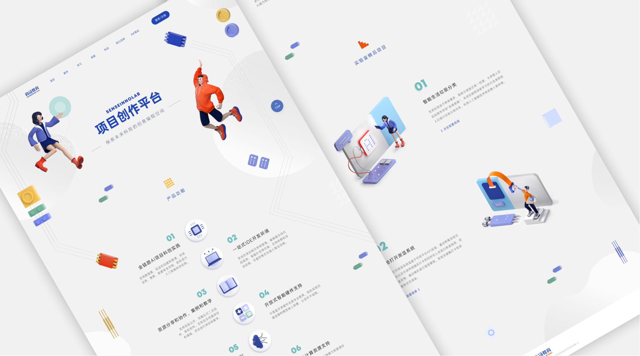
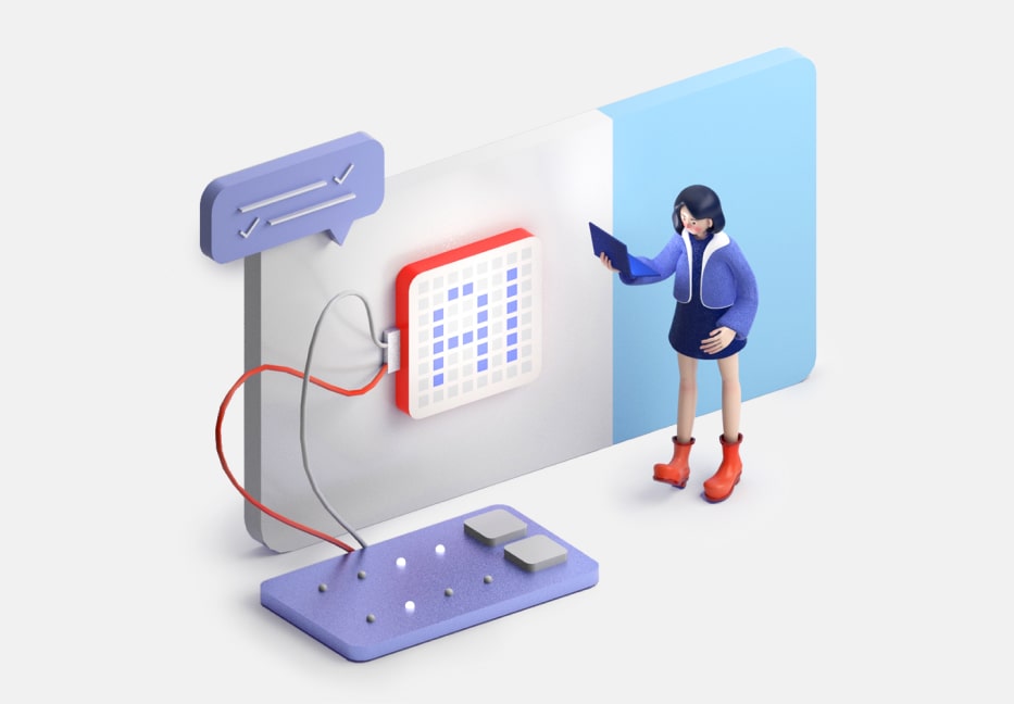
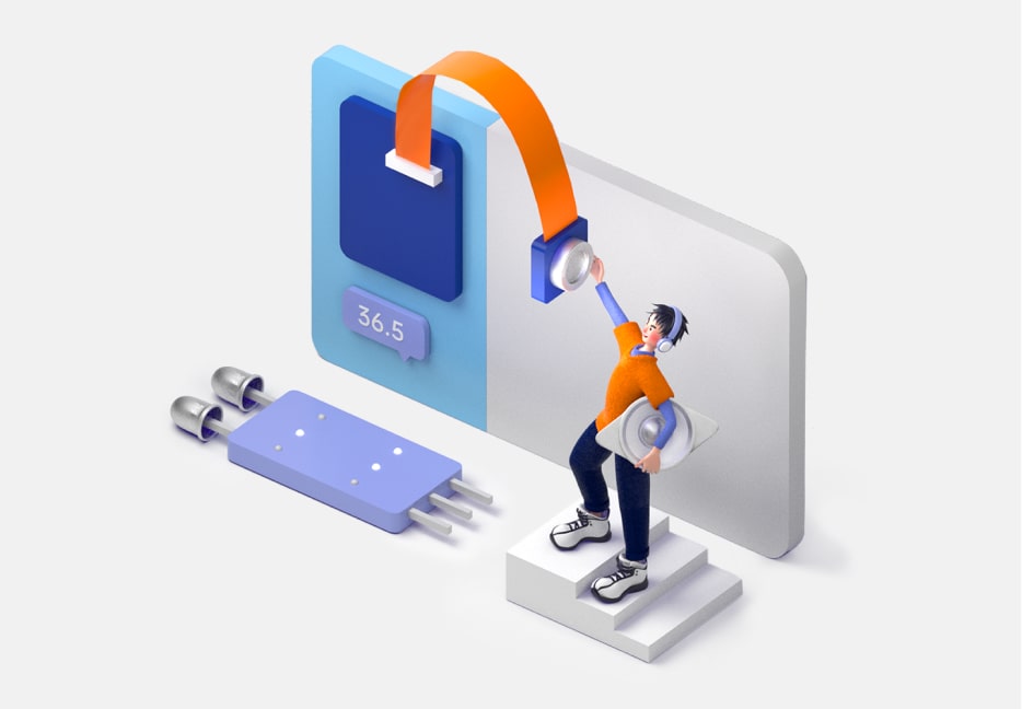
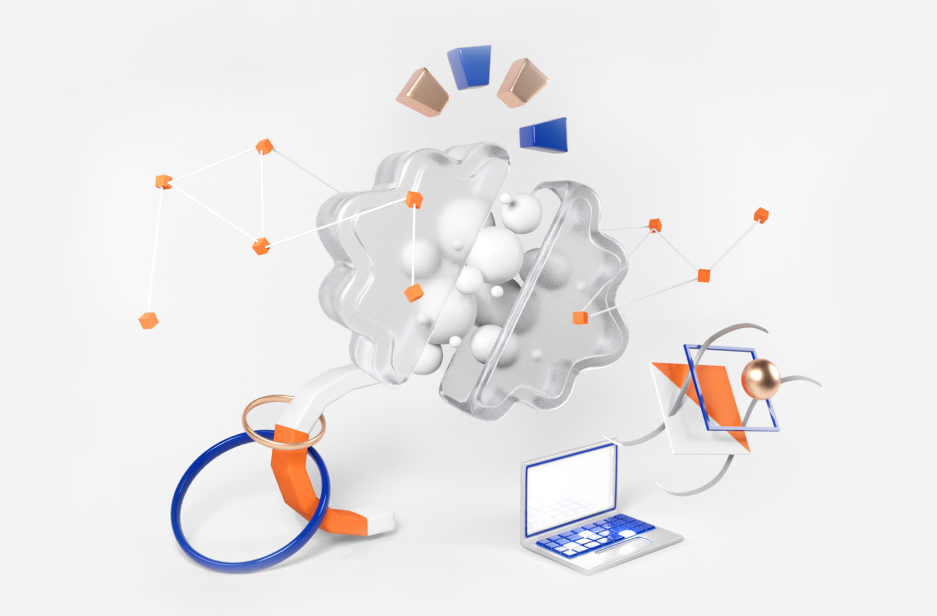
Using the 3D characters that I modeled, I redesigned the product's explore page. This product teaches K-12 students software development for AI sensor hardware in their IT classes, so I also created reusable 3D assets related to sensors and cameras.
Explore Page
Login Page Redesign
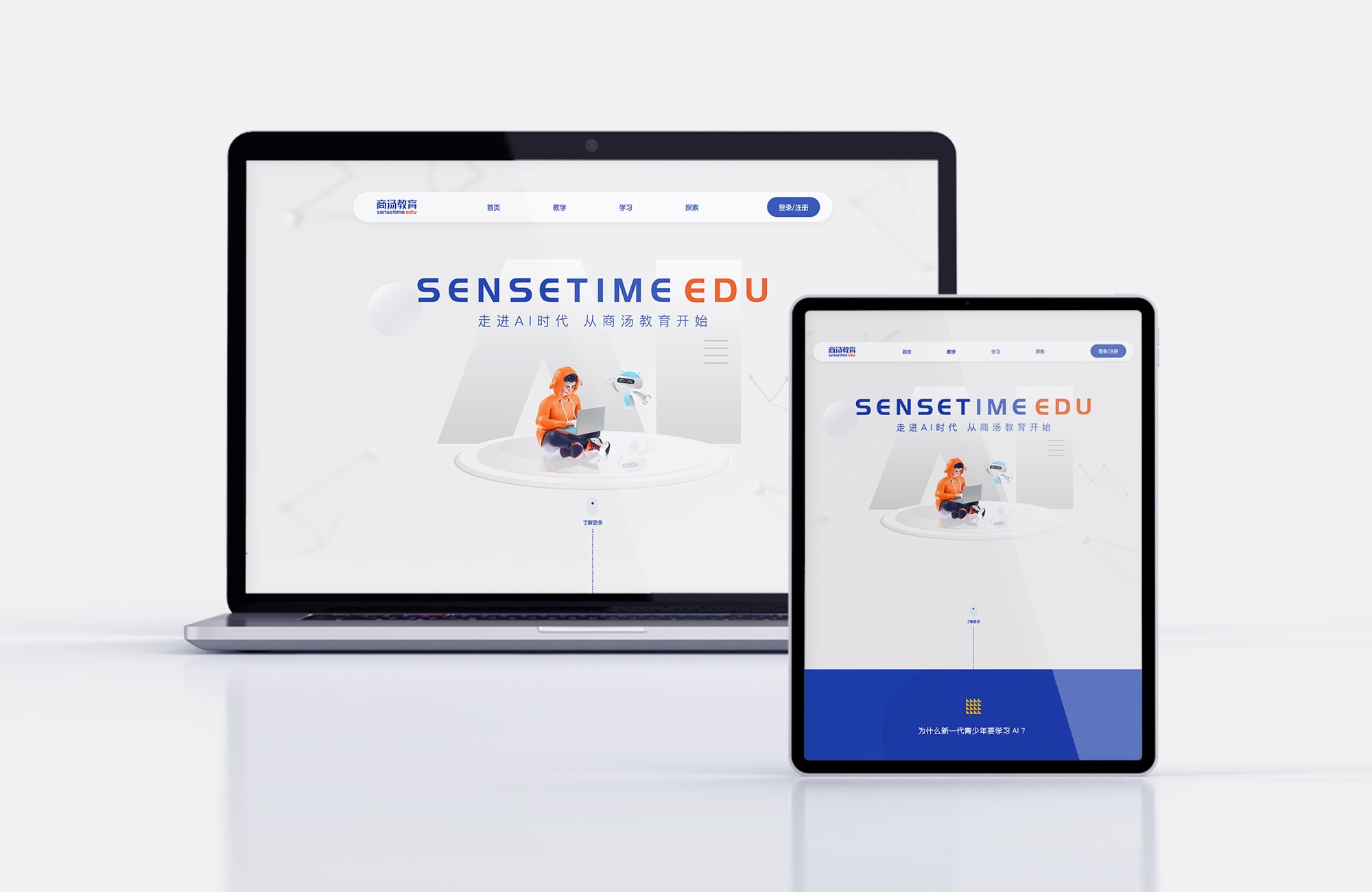
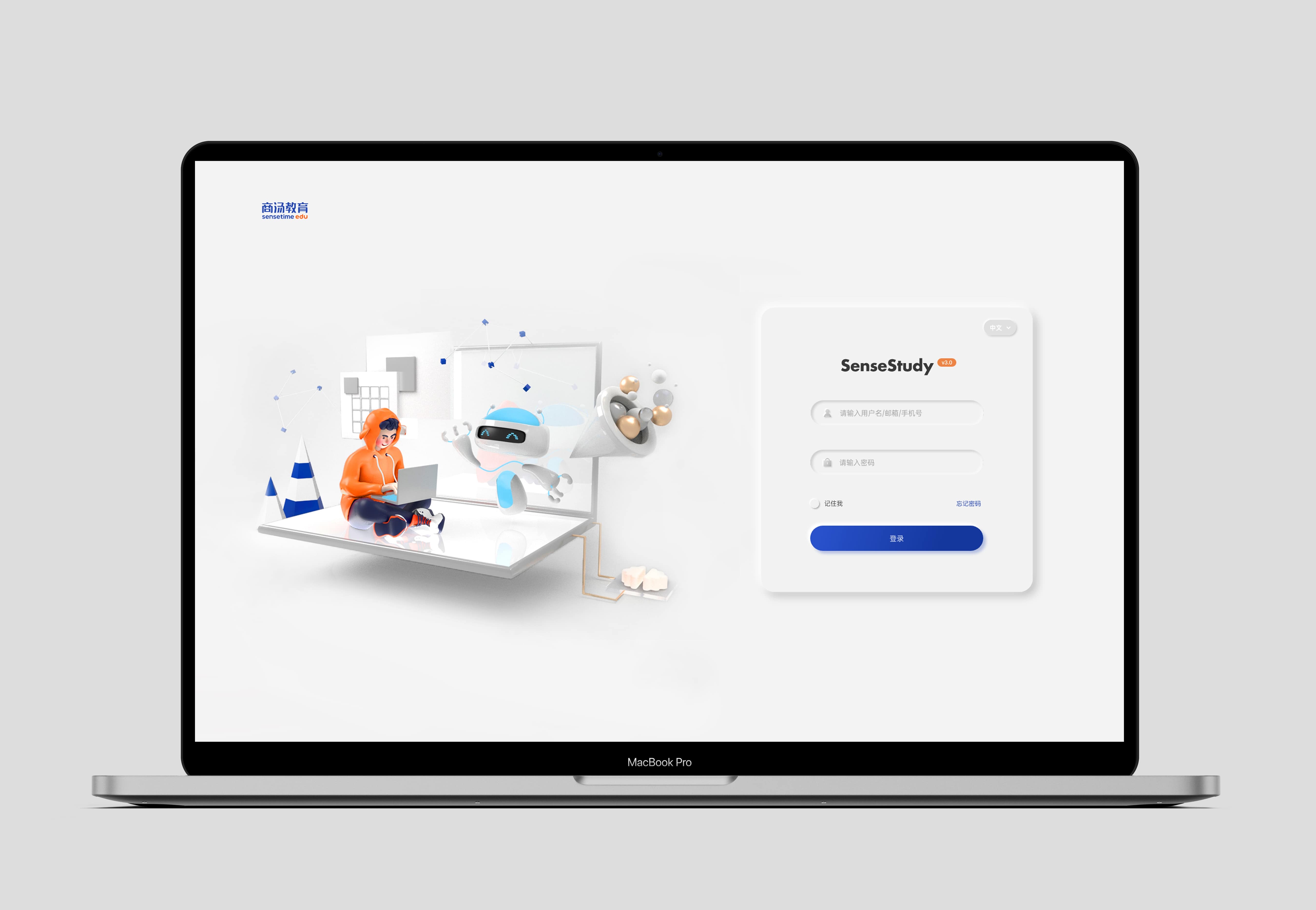
Lastly, I redesigned the education website's login page. The main audience is teachers, so the UI is more minimal to convey the logical nature of computer science. Ultimately, the renders were used on the Home page instead.
Home Page
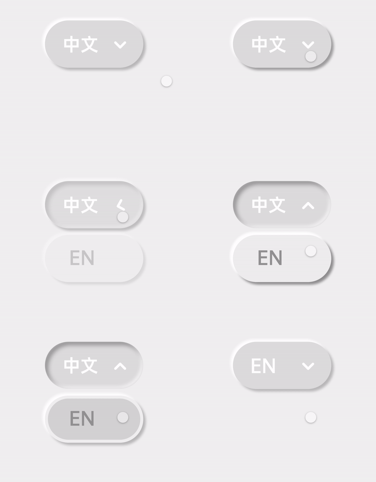
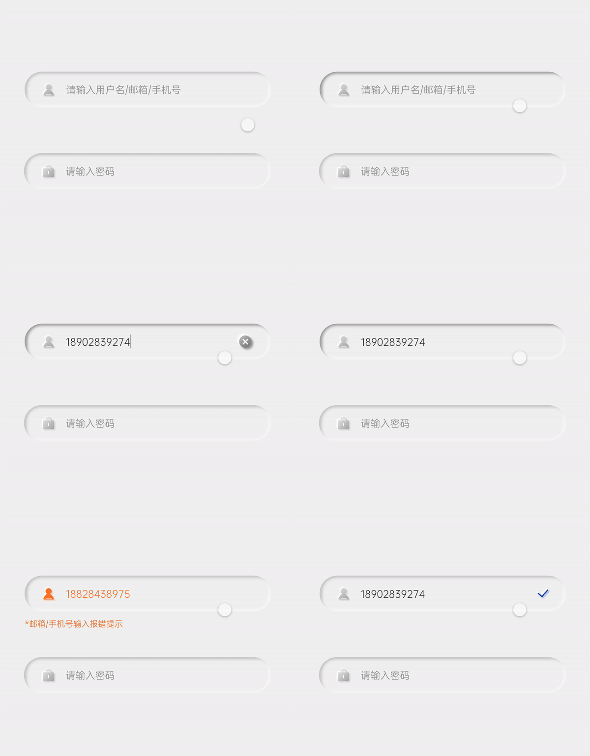
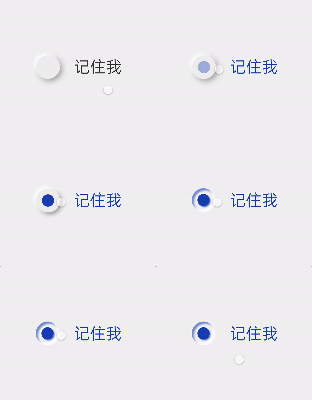
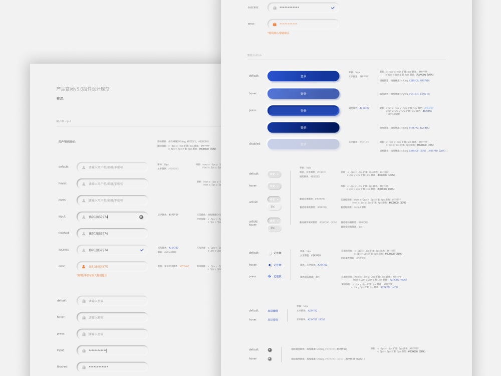
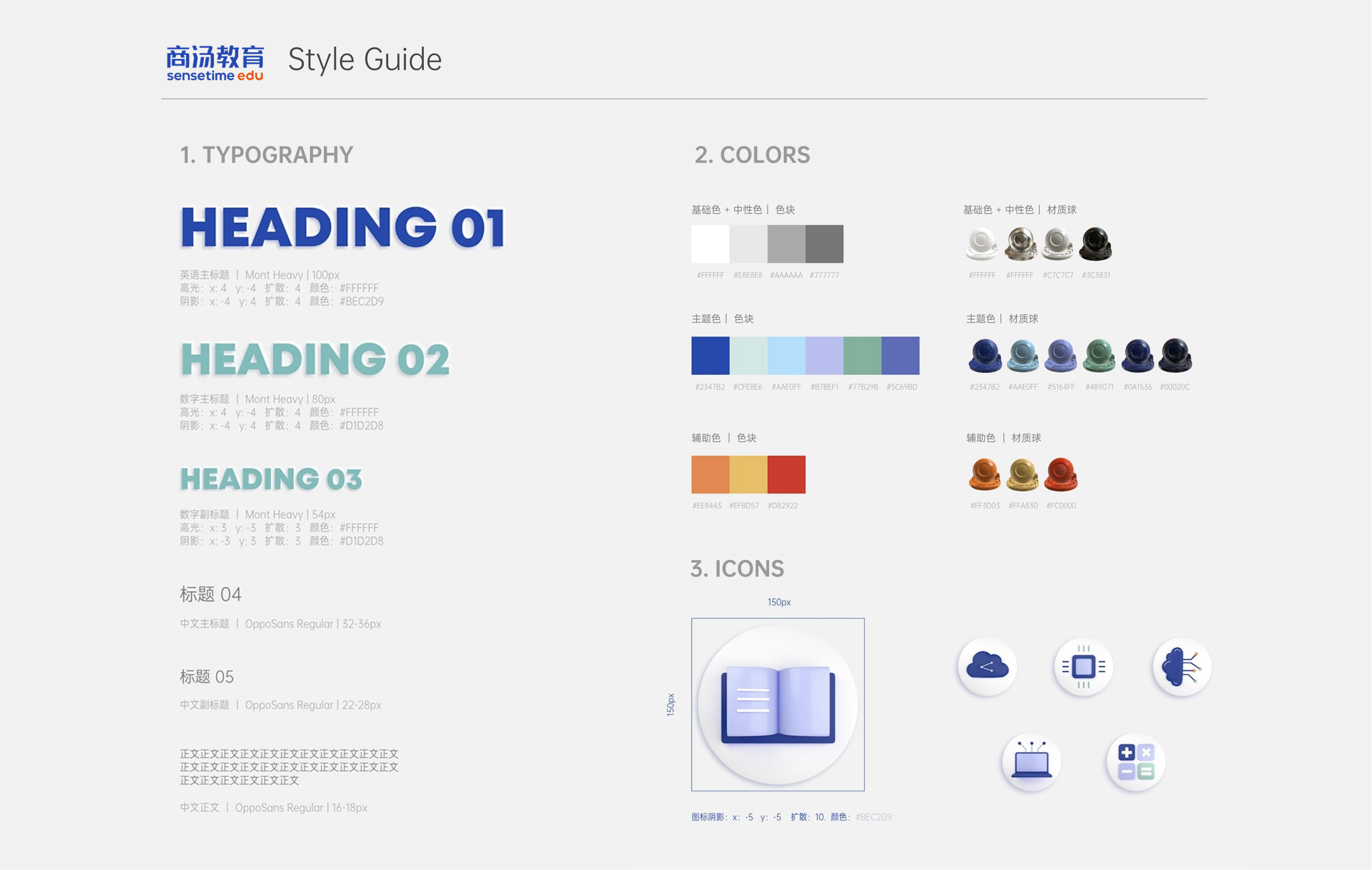
Neumorphic UI Design System Exploration
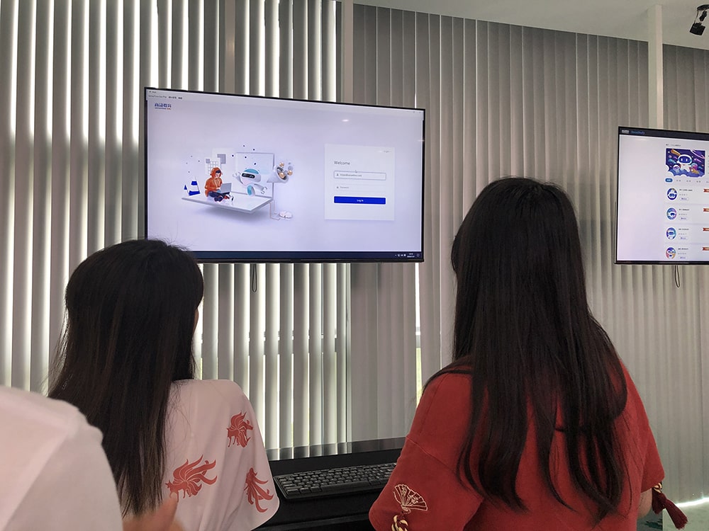
My design is displayed in the company's exhibition hall!
SenseSpace
Smart Community Web App
While I can't disclose all the project details due to NDA, feel free to reach out to me and I would love to talk more about what I did!
For now, you can see the login page I designed.
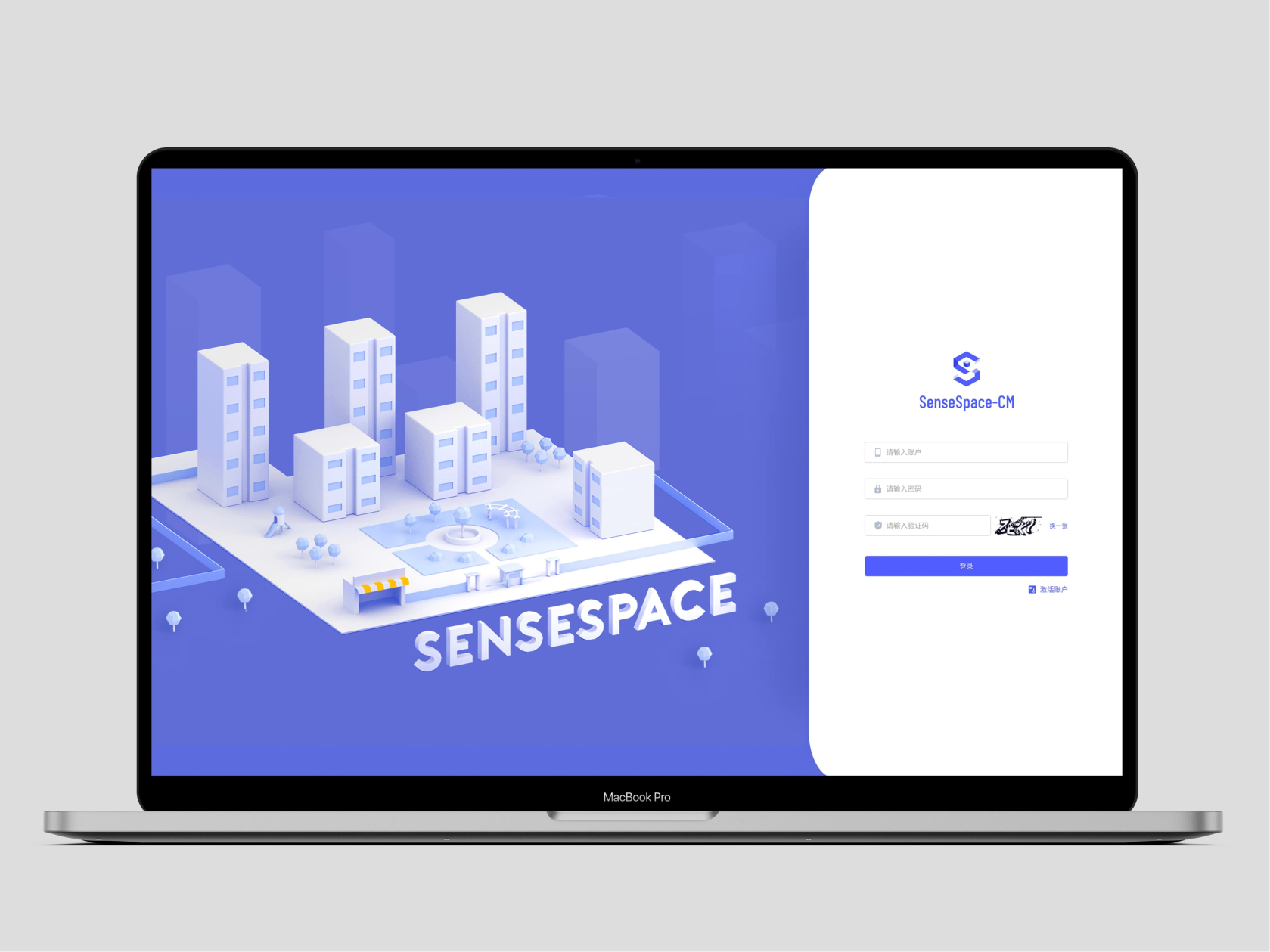
Problem
Objective
My Role
Outcome
1000+
active users
100
compounds by 2021
Q4 2020
product launched!
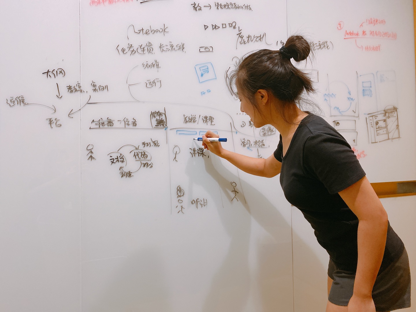
Whiteboarding sessions
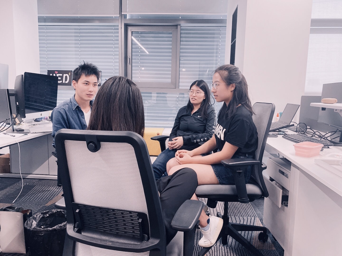
Daily discussions
Takeaways
Working cross-functionally with PMs, Engineers, and Designers, I grew immensely as a designer and team player. This project also taught me how to resolve many UX and visual design problems.
1. Accessibility for an aging population
Since the smart community web app's main users are security guards over 50 years old, I learned to prioritize simple interactions and clarity over visual design.
2. UI trends might not be all-inclusive
I initially designed a Neumorphic UI system for the education platform, because its realism is more coherent with 3D design. However, after doing more research on the topic, I learned that its use of low color contrast makes it hard for visually impaired people to see. I archived my old document and stuck with 2D UI designs to ensure that our platform is all-inclusive.
3. Inconsistent user needs
We are humans and what we say isn't always what we want. Each week, we are faced with new problems on how to design the experience of new functionality. Instead of creating new designs to solve new problems, we should maintain a holistic view and approach new problems with existing interaction designs in mind.
More Highlights
Sense Hackathon
Other than the SenseStudy and SenseSpace projects, I also participated in the internal hackathon. It was super fun presenting my project in front of all the judges and cheering my colleagues on during the award ceremony!
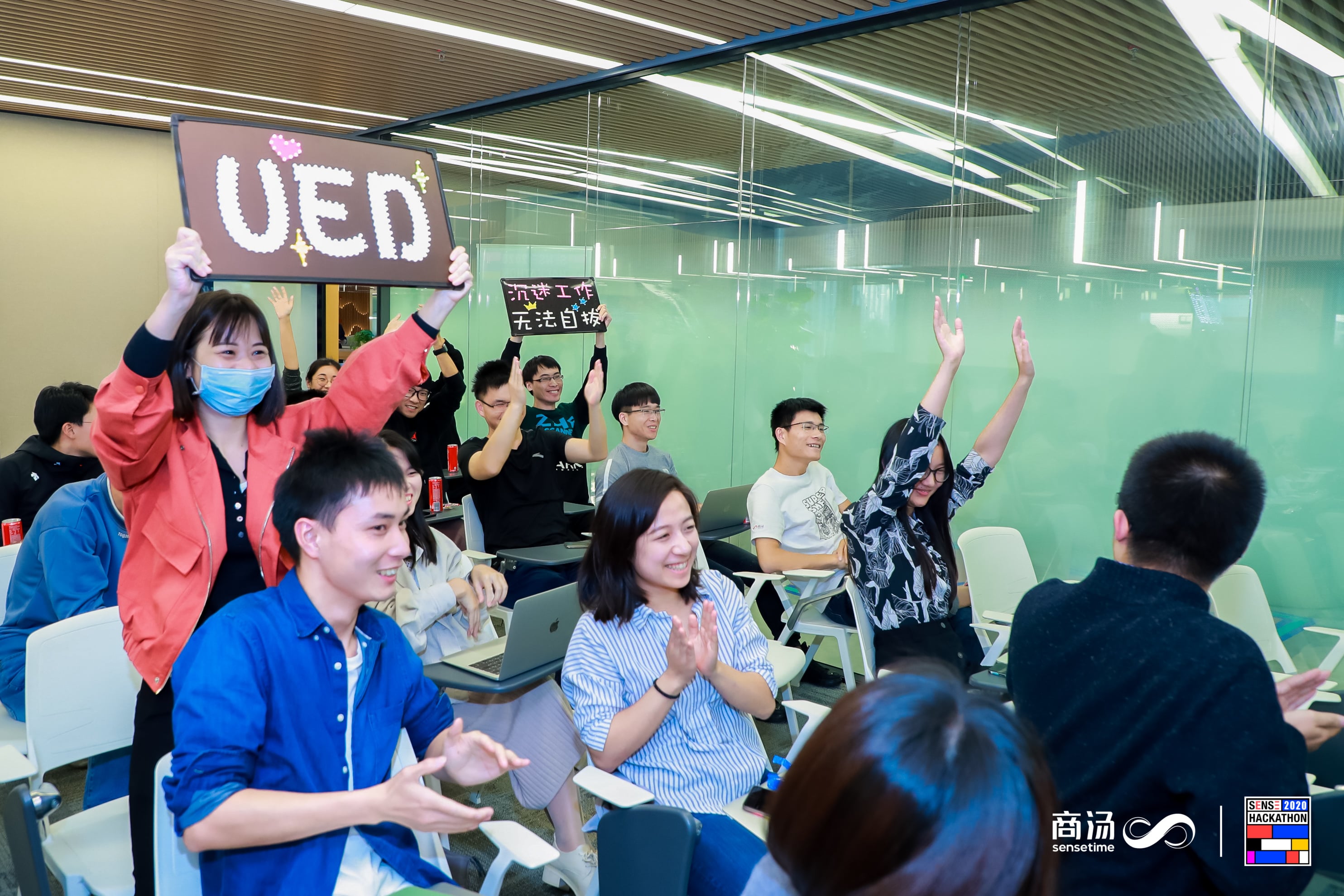
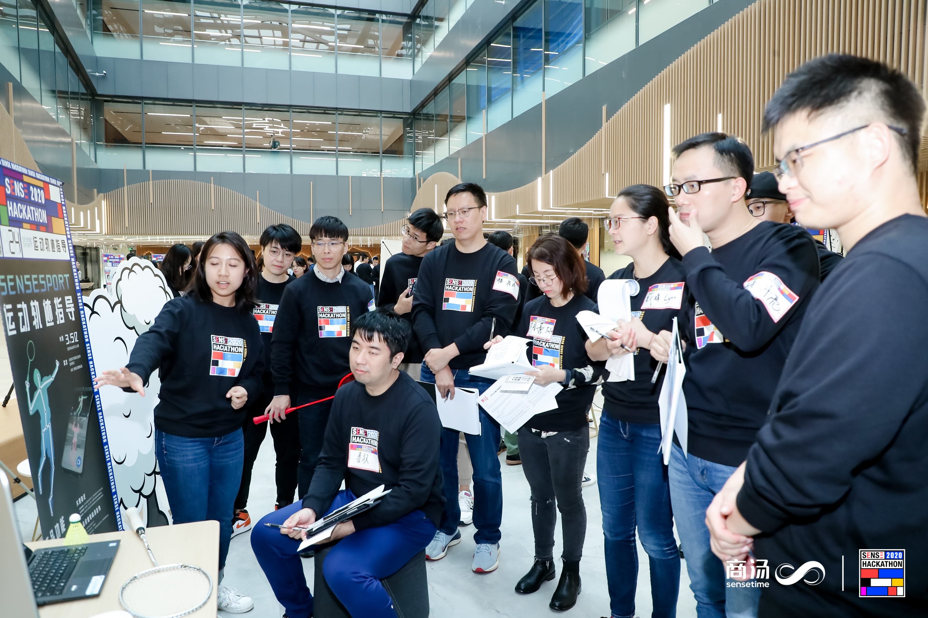
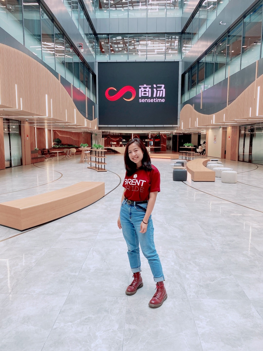
If you are down here already, thanks for taking this journey with me! I would love to hear from you to talk more about my projects. Otherwise, thanks for reading!
