Microsoft
Designing a chatbot builder for simple flows on Azure
UX Design Intern
Dec 2020 - Jun 2021
Azure Apps and Infrastructure Team, Michael Shao (Manager), Xianghao Xie (Engineer)
Overview
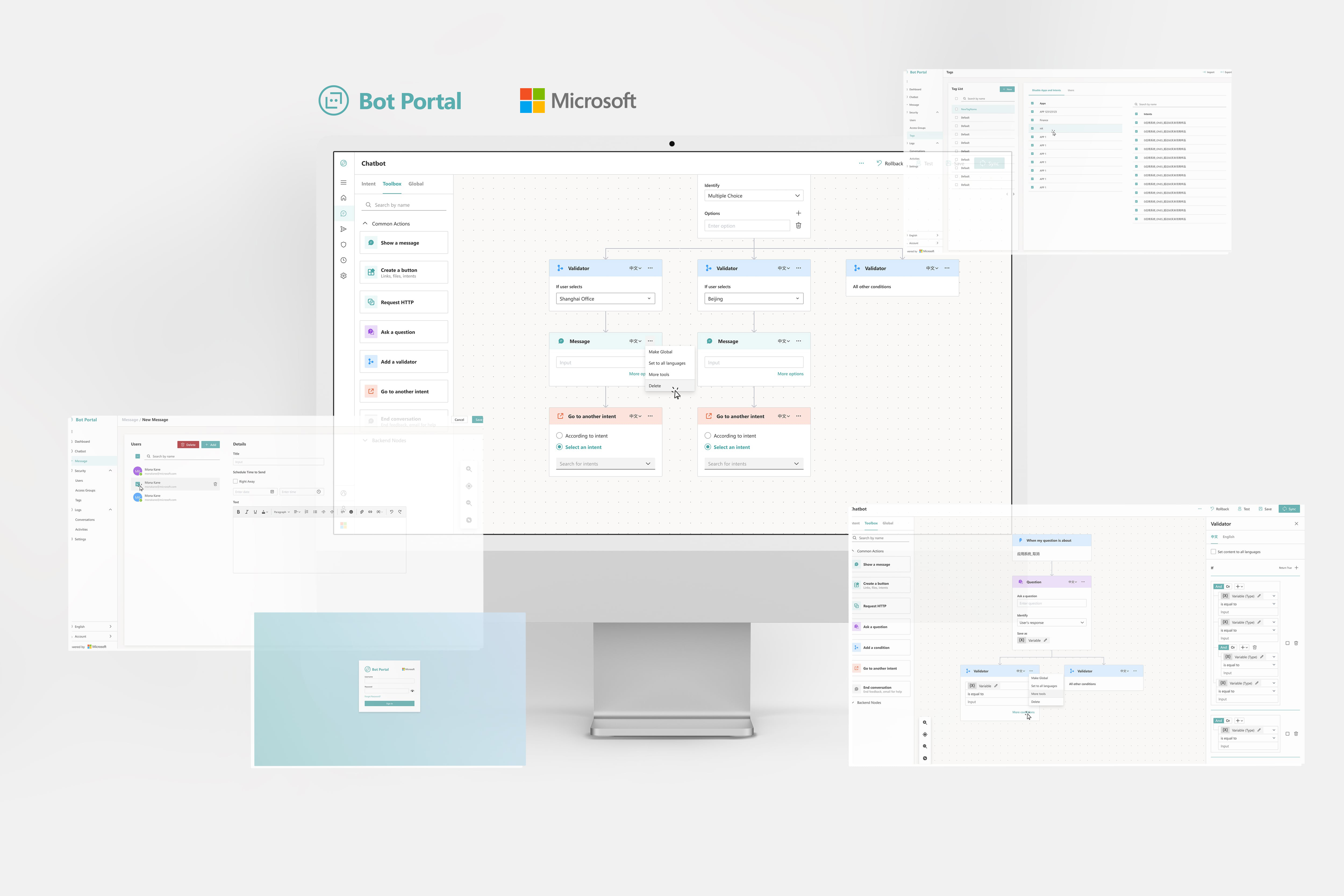
From Spring to Summer 2021, I worked at Microsoft on the Azure Apps and Infrastructure team to improve B2B cloud and analytic products. One of the projects I participated in was Bot Portal, a web chatbot builder that operations managers use to answer internal company questions from employees.
As the only designer on the team, I led the web app's end-to-end UI/UX redesign. I was partnered with another senior engineer who acted as the PM.
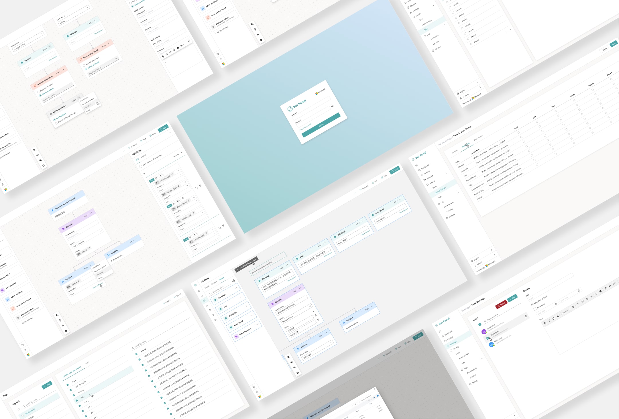
Problem
Objective
Outcome
10K+
monthly active users in Fortune 500 companies
66%
decreased time to create a simple flow
Q4 2021
product update release
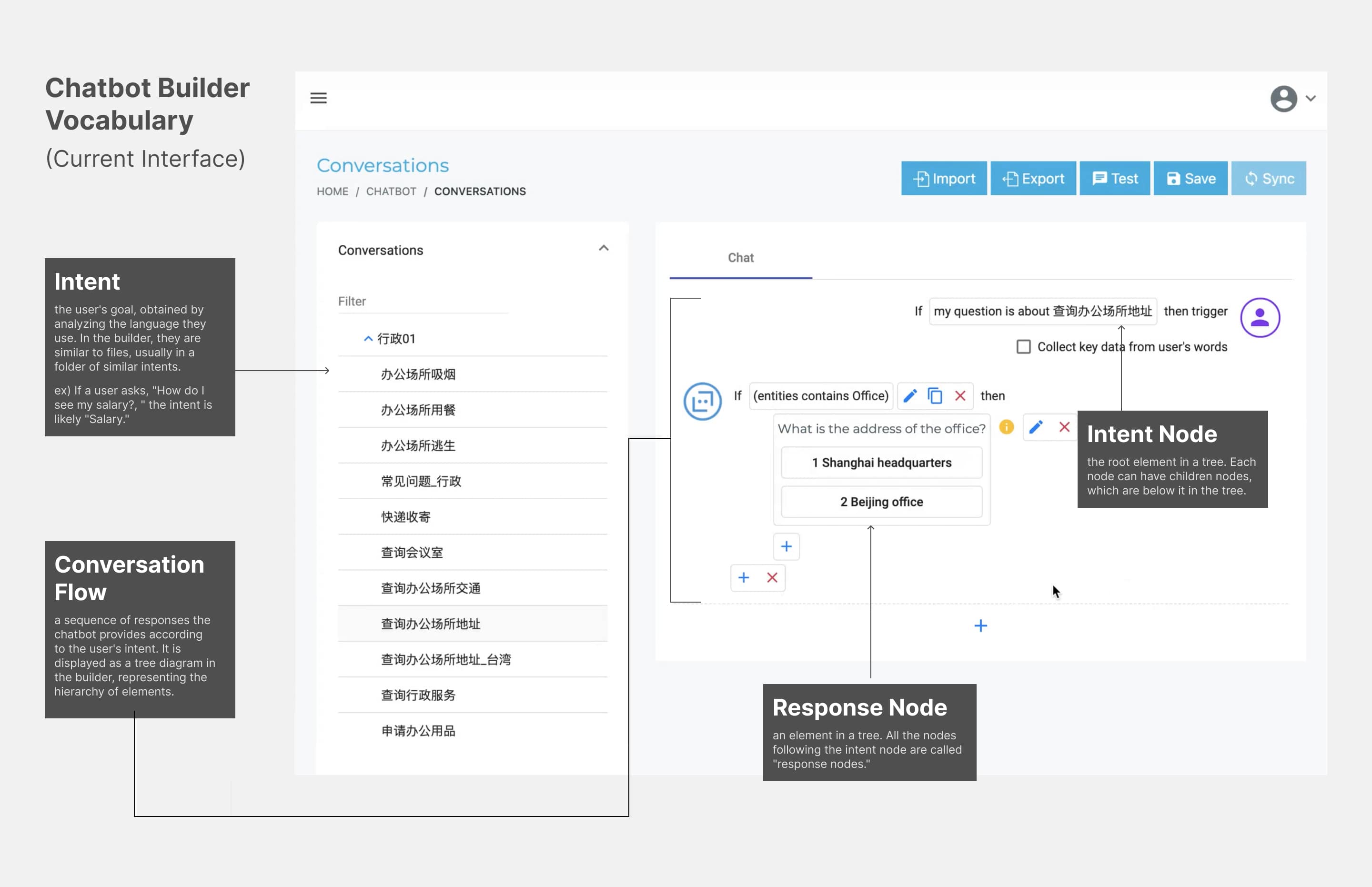
Before diving into the process, let me clarify some keywords for describing the interface:
Pain Points
Through user interviews, the senior engineer and I discovered an operations manager's top difficulties when building a conversation flow.
⏱ Slow interactions
It takes the user 4 clicks to create one response node and users must use indices to represent options.
🛑 Interrupted flows
Text and file editors all exist as modals currently, which interrupts the user's actions and disables the main content.
💥 Choice overload
There are 14 response nodes for users to choose from, easily overwhelming users building simple flows with less than five responses.
🔁 Redundant workflows
It is time-consuming to recreate the same nodes.
Project Goals
How do we make the chatbot builder accessible for creating simple flows?
Create faster flow-building interactions
Prioritize frequent actions
Enable users to save common nodes
Final Designs
Despite facing many challenges, I was super proud of leading the design of this new iteration, prototyping almost 200 screens. Jump to the process section to read my decision processes!
Redesign 1
Build flows quickly
Users can simply drag and drop nodes from the toolbox to build the conversation flow. I reduced a 4 click step to 1 drag and drop when creating a response node.
Redesign 2
Edit details in the sidebar
The sidebar effectively hides complicated actions and creates a consistent place to edit global nodes.
Redesign 3
Save common nodes
Users no longer need to recreate the same nodes. They can save common nodes as "global nodes," and when they edit the main instance in the Global Node Editor, instances of this node in all conversation flows are updated.
Process
Goal 1: Create faster interactions
Tree Structure
The current structure imitates code, requiring the user to initiate loops and add if statements. Referring to user feedback that wants a clearer display, I changed it to a vertical tree diagram to better show the sequence of events.
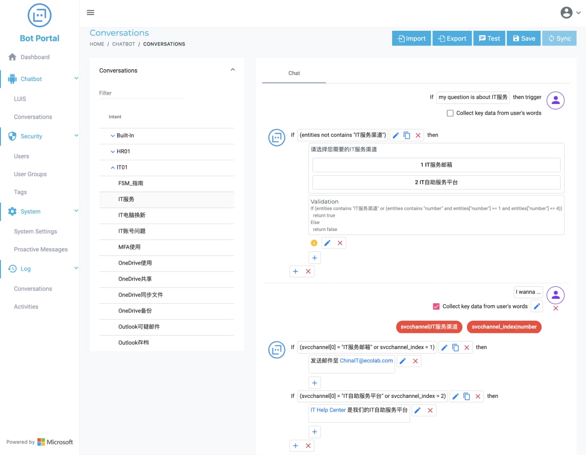
Before: Code structure
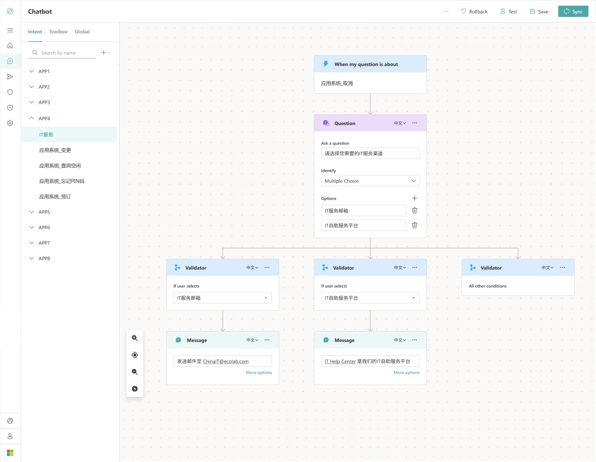
After: Tree structure - clearer display of the same content on the left
Drag and Drop Interaction
The current implementation requires users to use small add buttons to connect a response node. However, according to Fitt's law, the small targets are difficult for fast, frequent actions.
Therefore, by performing competitive analysis on similar products, the senior engineer and I decided on a drag-and-drop interaction.
Then, I performed user testing on 5 of my colleagues who never used Bot Portal before. Their task was to build one message response node and type "Hello World". On average, the time on task decreased from 15 seconds to 5 seconds, a 66% decrease in time.
Before: Small add buttons, 15-sec to build one message response node
After: Drag and drop, 5-sec to build one node, 66% decrease in time!
Goal 2: Prioritize frequent actions
Reducing Response Nodes
Through card sorting, I categorized actions under shared user motivations, which helped me combine response nodes. I reduced the number of choices by 50%, from 14 to 7, with the most frequently used "Show a message" node at the top.
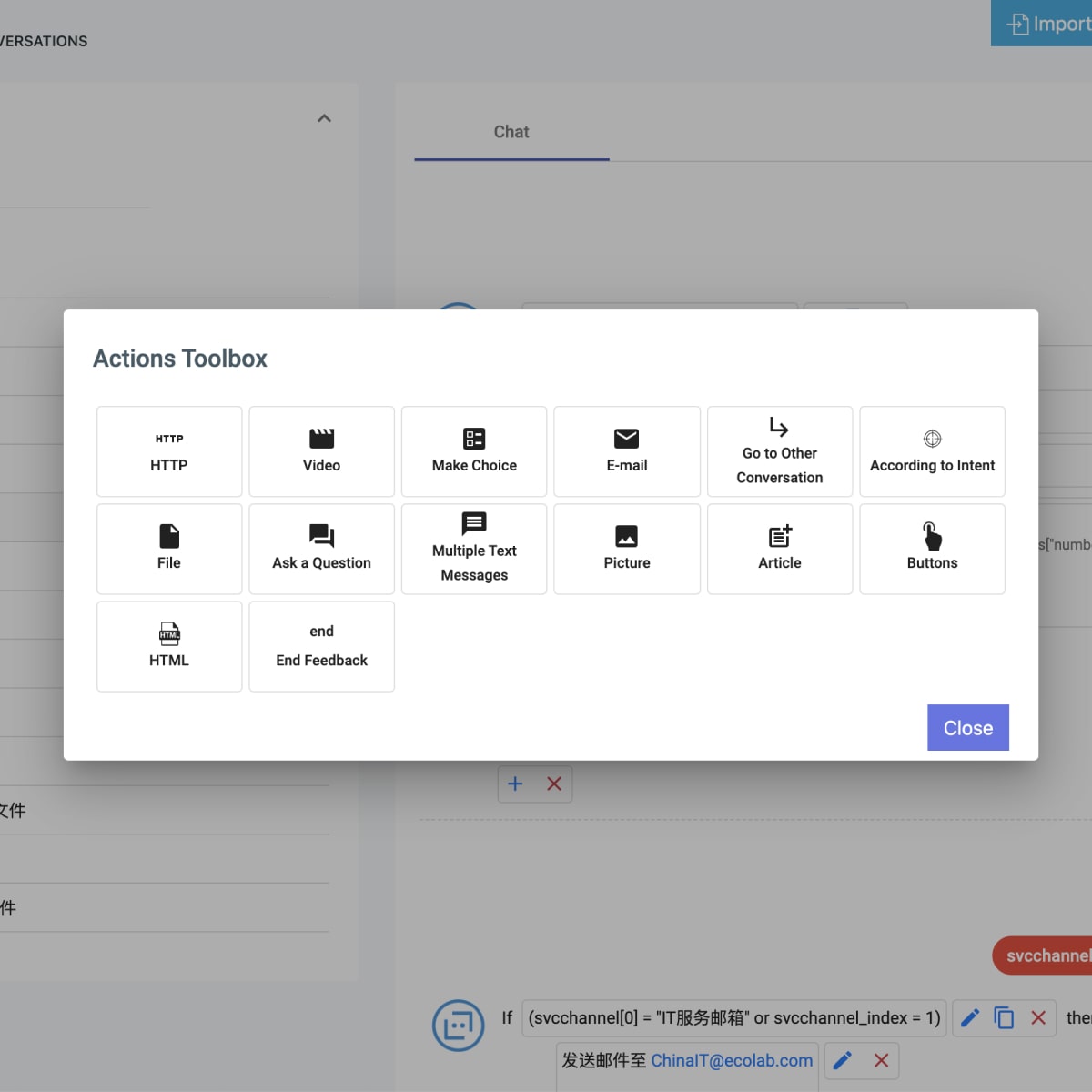
Before: 14 choices - too many!
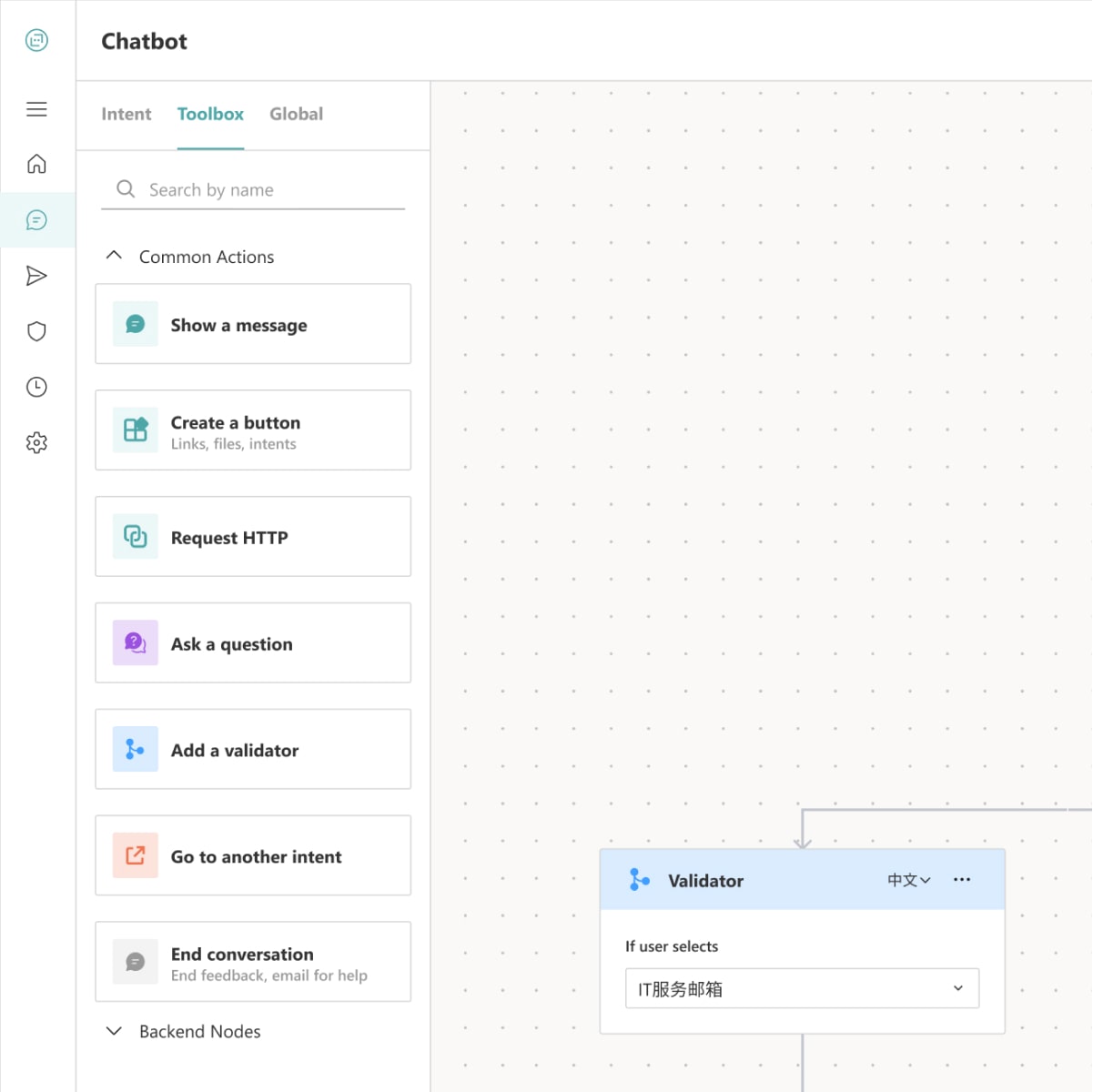
After: 7 choices
Goal 3: Save common nodes
Copy and Paste vs Global nodes
The current implementation copies and pastes a response node directly into the same intent, but user feedback states that they also want to paste into other intents and edit all copies of the same node at once.
Thus, I came up with the "Copy to clipboard" idea, allowing users to save common nodes to a clipboard that is accessible across all intents. However, user feedback shows that there are details in common nodes that are often updated, such as system version ids when the user asks the chatbot about IT-related topics.
Consequently, I prototyped a "Global nodes" feature, where users can save nodes as global nodes. When they edit the master instance, all instances of this node in different intents are also updated. This is the iteration approved by the senior engineer!
Before: Copy and paste into the same intent
1st Iteration: Copy to clipboard, accessible to all intents
2nd Iteration: Global Nodes, editing master component can change instances
Exploring and Testing
I created multiple interactive prototypes to test edge cases and compound use cases. This guided our critiques and evaluation process, which also prompted new features that the senior engineer plan to include in future updates.
New Feature 1: Adding customized intents, essentially allowing the user to create new words for the bot to recognize through the GUI
New Feature 2: Storing multiple languages in each node, so that the bot responds in the user question's language
Visual Design
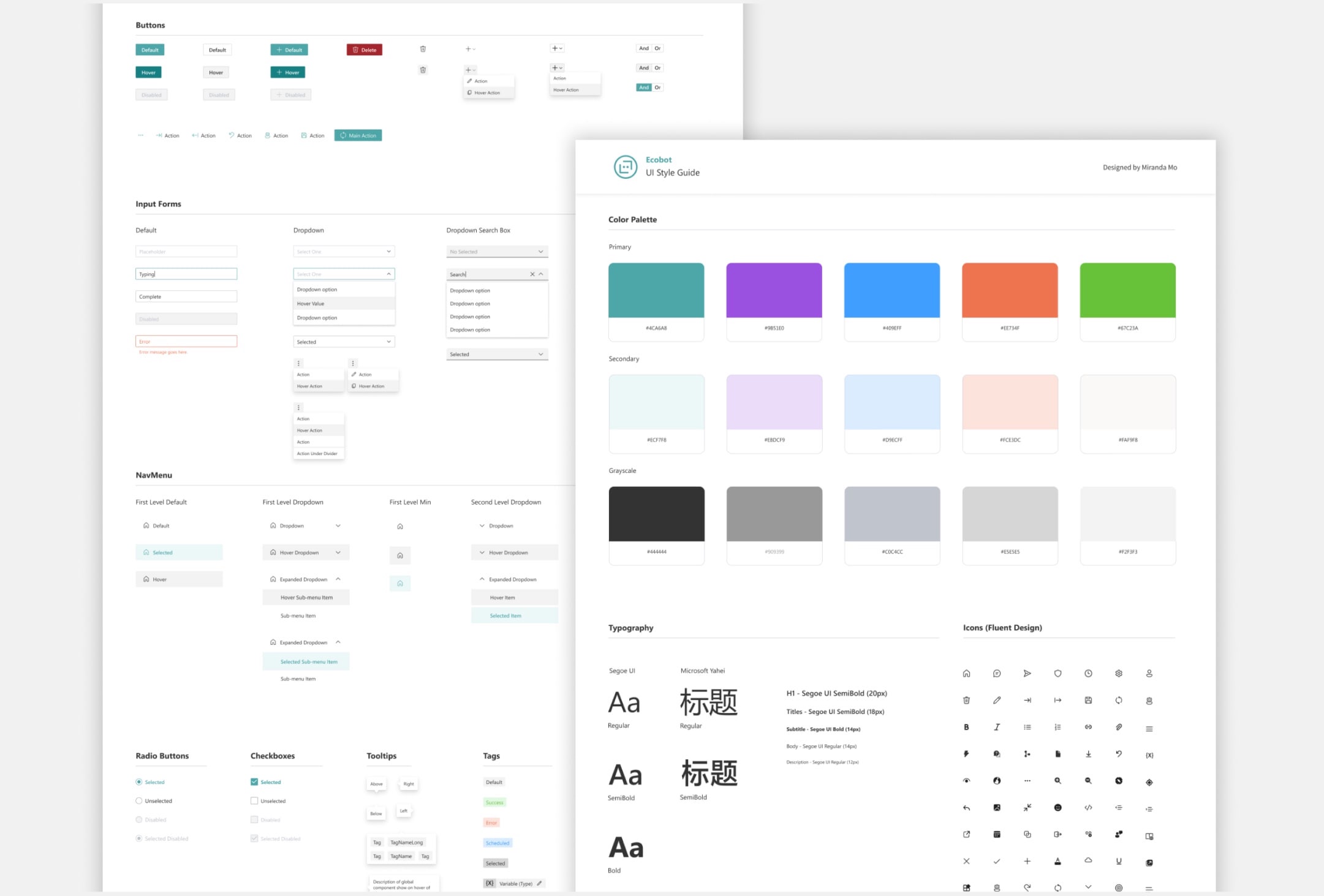
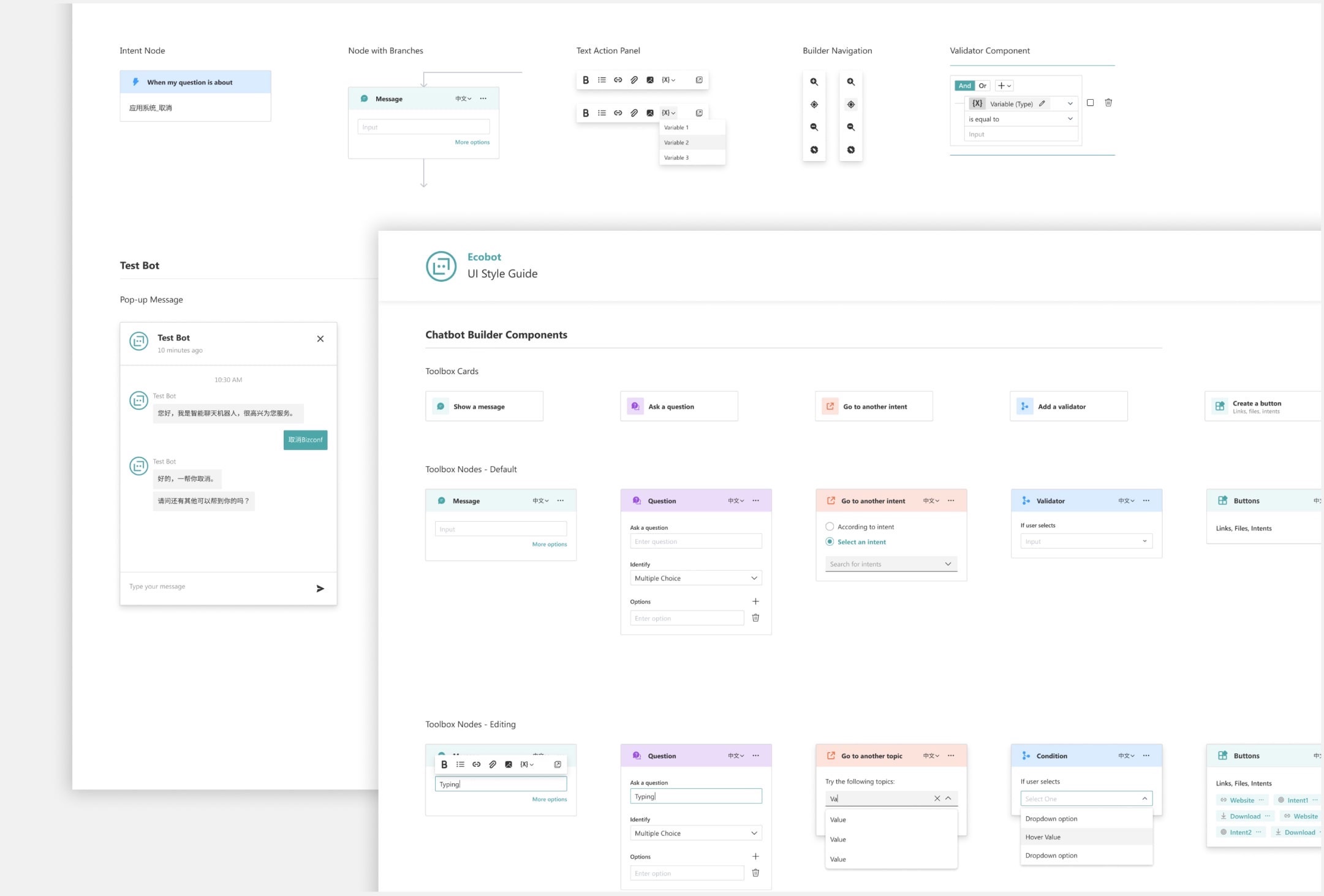
To underscore Microsoft's brand identity, my design system adheres to Microsoft's Fluent Design core principles. I also provided a UI Style Guide that lays out all the components and their states to guide the development process in Angular.
Takeaways
I grew tremendously as a designer and team player. Some key lessons include:
1. Accessibility
Drag and drop suggests that the user must be able to use a mouse and visually perceive draggable elements and drop zones. To make it accessible, the senior engineer and I discussed a list of requirements- namely, we must make 1) all draggable elements keyboard focusable 2) add event handlers for grabbing, moving, and dropping elements 3) add text that is only visible to the screen reader to guide the grab/move/drop process.
2. Presentation and documentation
While I was only collaborating with one other engineer, I needed to ask questions concisely to make sure my design choices were clear because we mostly worked remotely. Since this was a major redesign, I wrote a PRD so a new designer can easily pick up where I finished.
3. Getting feedback early
Demonstrating the functionality through prototypes better represented the user flows I was envisioning, which made the critique process easier. I also sought out designers on other teams to analyze the new user's experience to create informed and guided interactions.
More Highlights
Mixed Reality
Other than the Bot Portal project, I also developed UX solutions in Mixed Reality. I tried on HoloLens for the first time and even have my avatar made in MR 😂
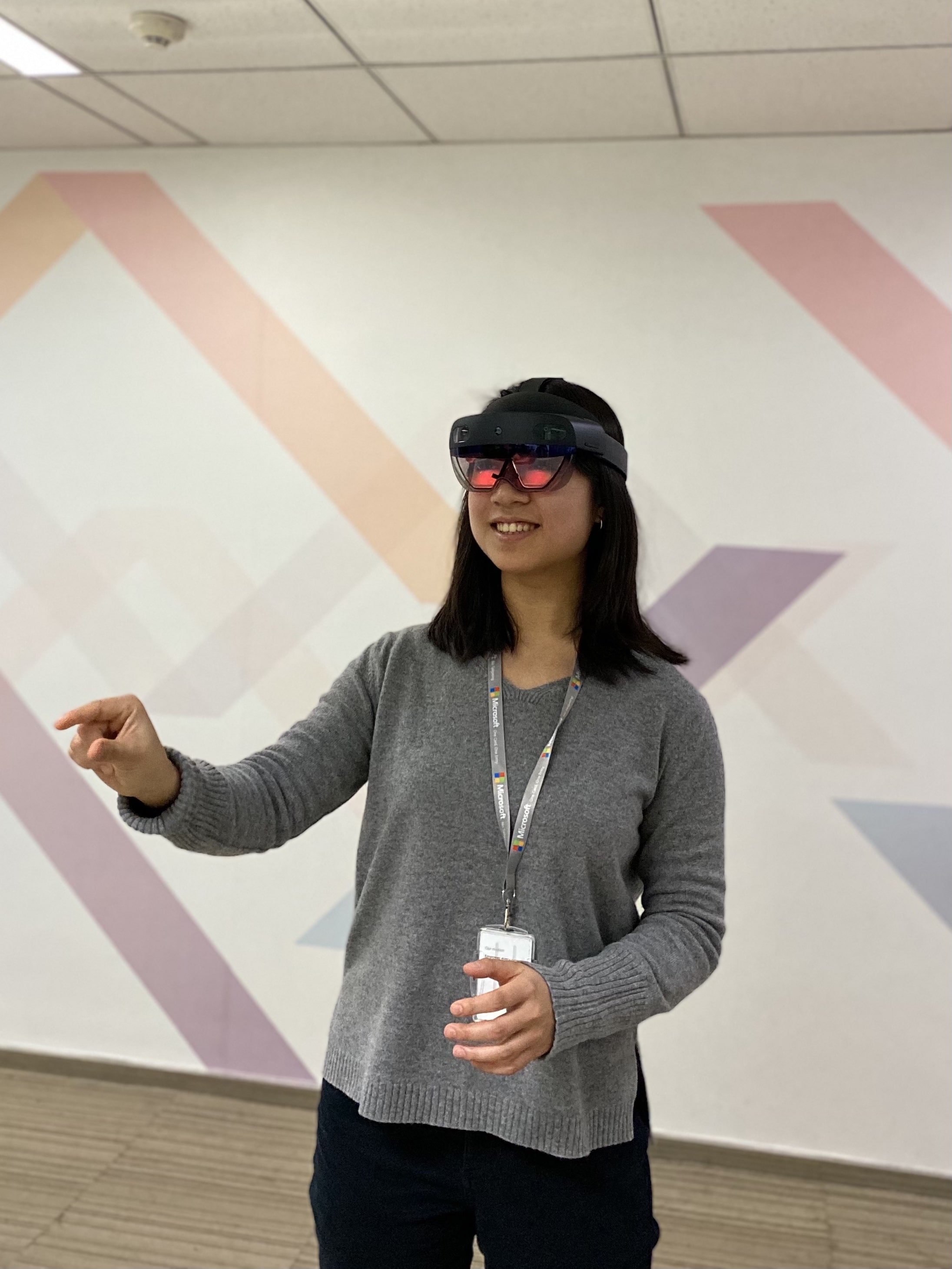
My first time using the HoloLens!
My (very ugly) avatar in Mixed Reality

Thanks for reading about my experience! If you are interested in chatting more about my work, I would love to hear from you :))
