Feed Me
Helping students sell excess cafeteria credits
Product Designer
Front-end Engineer
Nov 2019 - Ongoing
Brandon Lee (Full-stack Engineer), Erica Li (PM and Back-end Engineer)
Overview
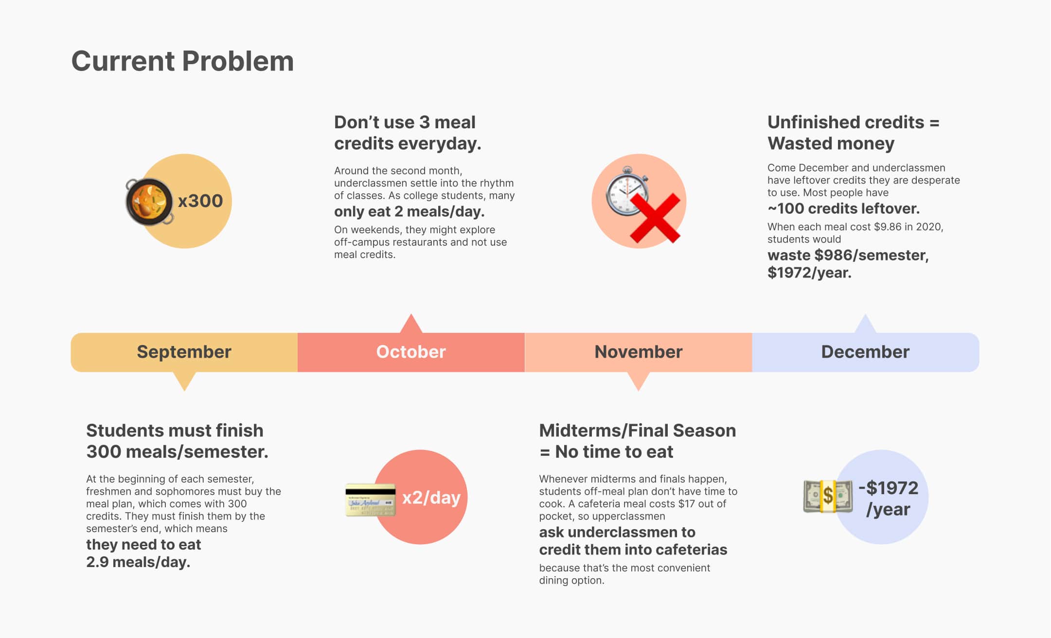
Many universities require underclassmen to buy meal credits that can only be used for on-campus dining. Most students cannot finish them before they expire, wasting thousands of dollars. I had around 200 meal credits leftover in my freshman year, losing ~$2000.
On the other hand, upperclassmen who live off-campus find on-campus dining convenient, but too expensive. Therefore, we saw an opportunity to help students profit from the supply of on-campus meal credits and the demand of off-campus students.
We began this project at HackPrinceton2019, a 36-hours hackathon, where I acted as the sole product designer and front-end engineer. After the hackathon, I redesigned the interface to improve usability.
Problem
Objective
Outcome
6000+
potential users
Research
Interviews
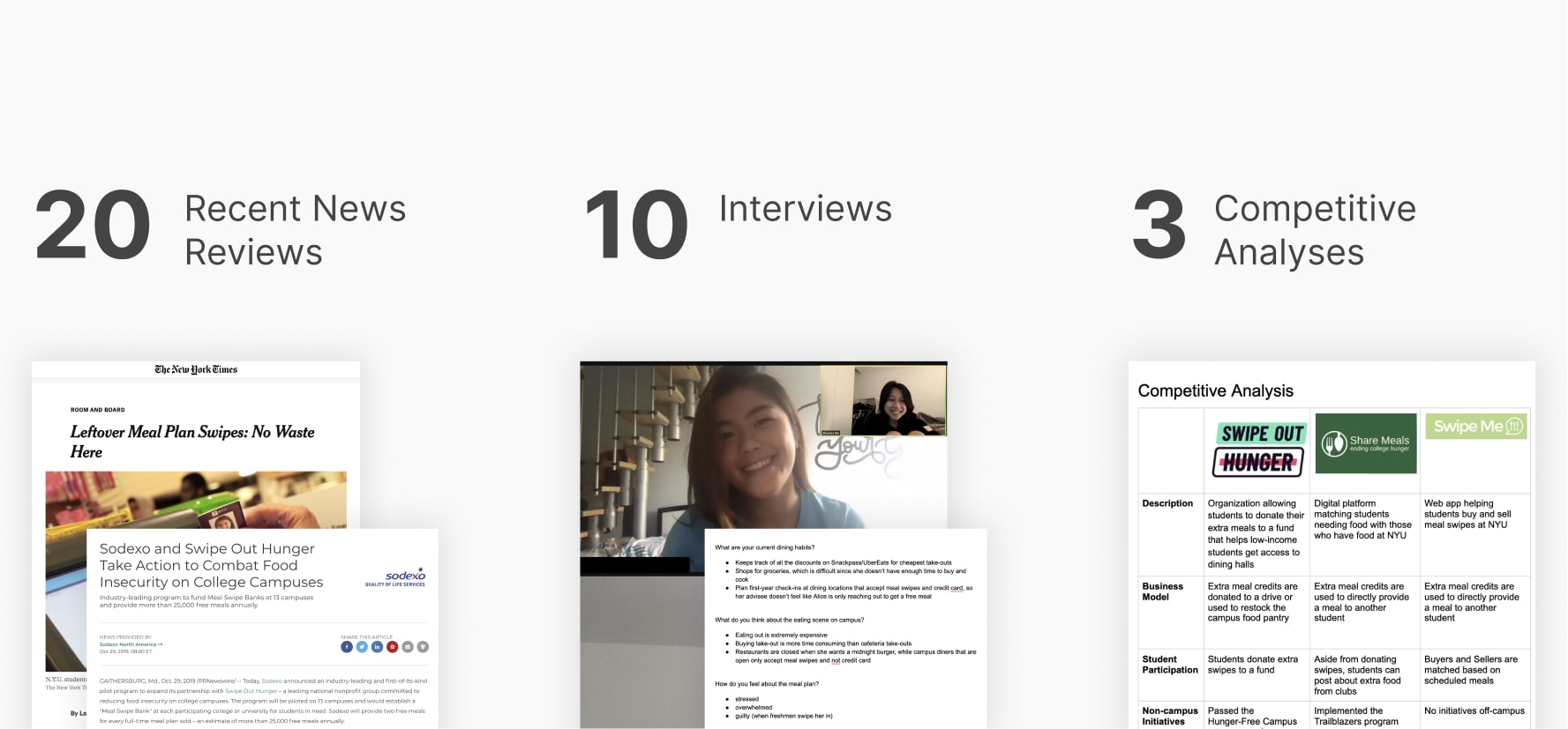
With only 36 hours, I conducted online research to understand the current problem space. We also interviewed 10 upperclassmen who experienced both the on and off meal plan lifestyle, two of which also worked as dining service workers.
💻 Existing paradigm
Facebook groups exist for students to share free meal credits. However, posting in groups frequently is a don't of social media etiquette, so few people use this platform.
🧑🍳 Dining service workers
They noticed that students will buy more food than they can eat to get rid of credits. Most of the food is barely eaten and thrown away.
👦🍗 On meal plan students
They feel guilty when they forfeit credits and waste money. Many are willing to give out free meals so that the university doesn't "take their money, " but they don't know who to give it to.
👩🦱❌🍗 Off meal plan students
They miss the convenience of campus dining because cafeterias are close to libraries, where students spend most of their time. However, they find meal credits too expensive to be worth the convenience.
Competitive Analysis
We analyzed the drawbacks of apps with similar meal-sharing initiatives, which helped us design Feed Me to fulfill our competitor's limitations.

🍬 Lack of incentive
Most apps rely on students' altruism to donate extra credits.
🧍🧍 Need for workers
Some initiatives require workers to hand out vouchers converted from donated credits.
Pain Points
Through our brief research, we synthesized the following problems to address:
💸 Wasted money
On-campus students wish they can get their money back for leftover credits.
🗑 Food waste
On-campus students would buy food that they don't need to not waste credits.
🧍❌🧍 Lack of connection
On-campus students don't know who to give their meal credits to.
💰 Expensive
Off-campus students find on-campus dining too expensive despite its convenience.
Project Goals
How can we connect students with excess meal credits to other students who want convenient and cheap on-campus meals?
Incentivize Givers to share by helping them earn money
Create a safe and easy way to share and claim meals
Sustain user engagement and activity throughout the year
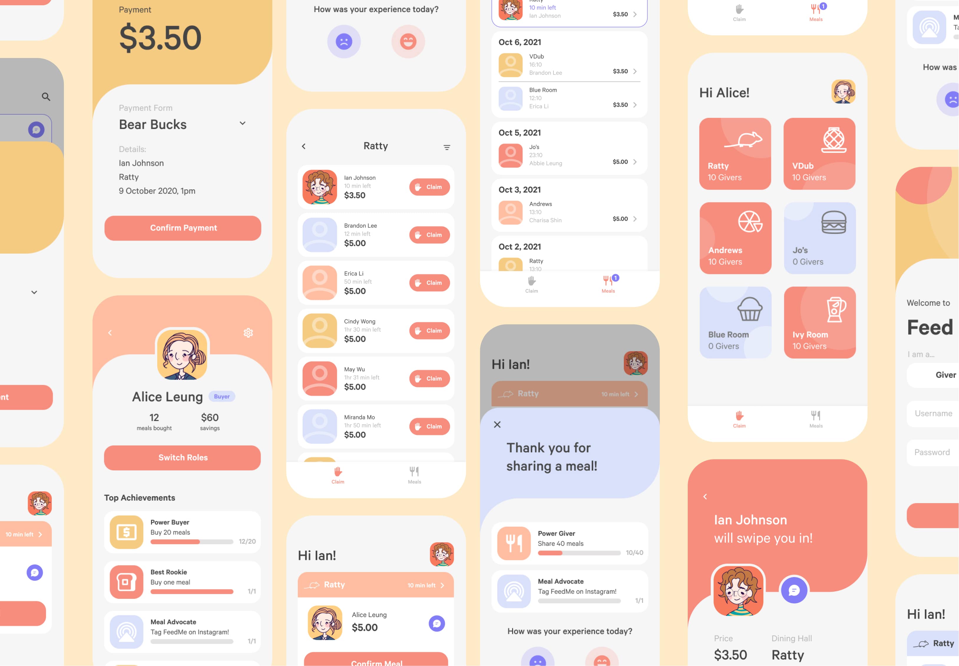
Final Designs
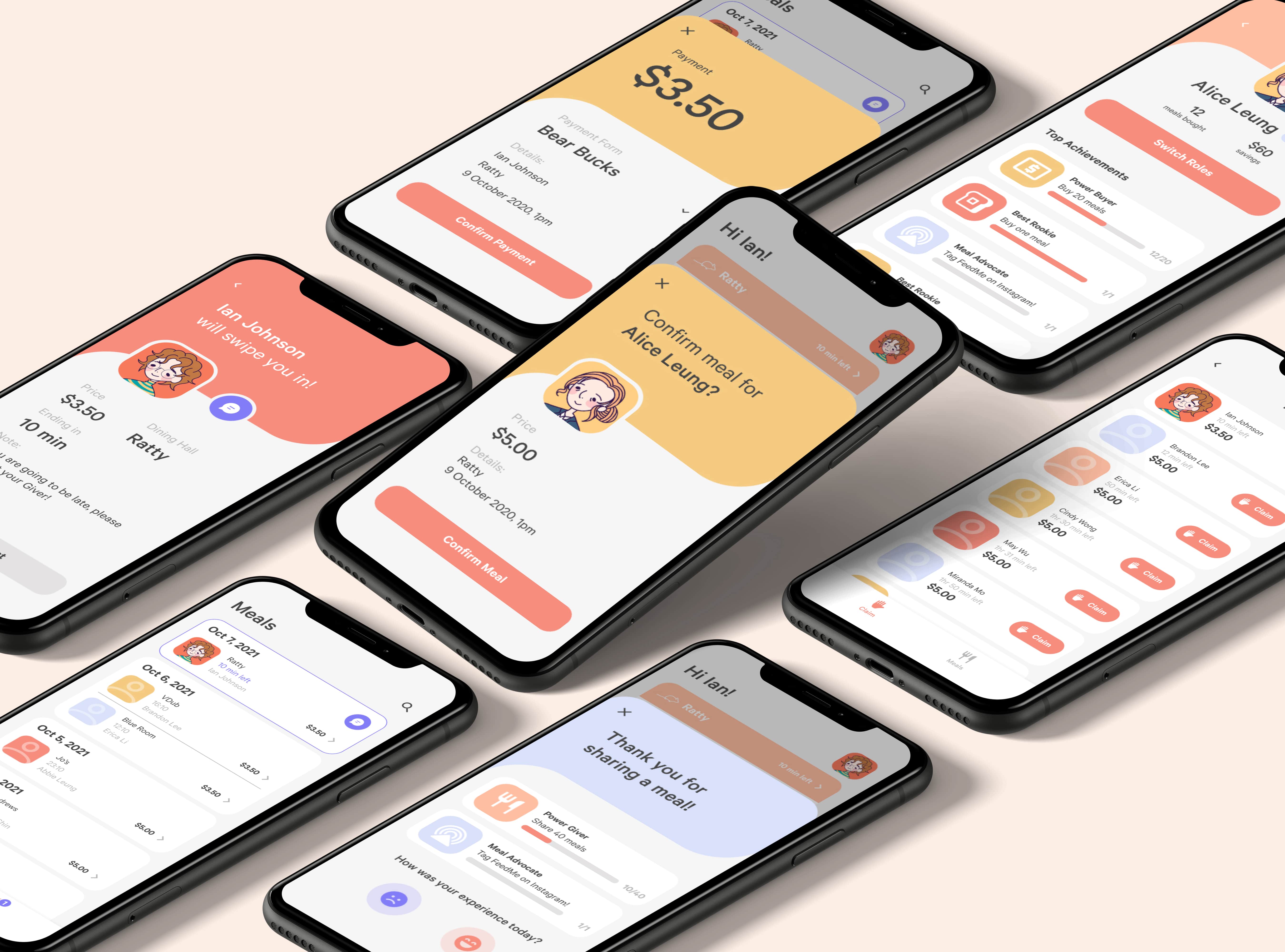
Feed Me's was revamped after the hackathon. Jump to the process section to read my decision processes!
Design 1
Quick Sharing
Only 2 clicks to share a meal! When the Buyer meets up with them to get credited into the dining hall, they can confirm the meal.
Design 2
Easy Claiming
Just 2 clicks to claim a meal. Buyers can call or text the Giver when they arrive at the dining hall.
Design 3
Secure Payments
Users can pay with their existing school currency Bear Bucks. No bank cards are required!
Design 4
Customizable Prices
The Giver can decide on a credit's price, ranging from $0 to $5. Because there will be a surplus of credits at the end of the semester, Givers will lower prices to get rid of credits ASAP. Therefore, we encourage Givers to sell throughout the year to maximize their profits.
Design 5
Profile
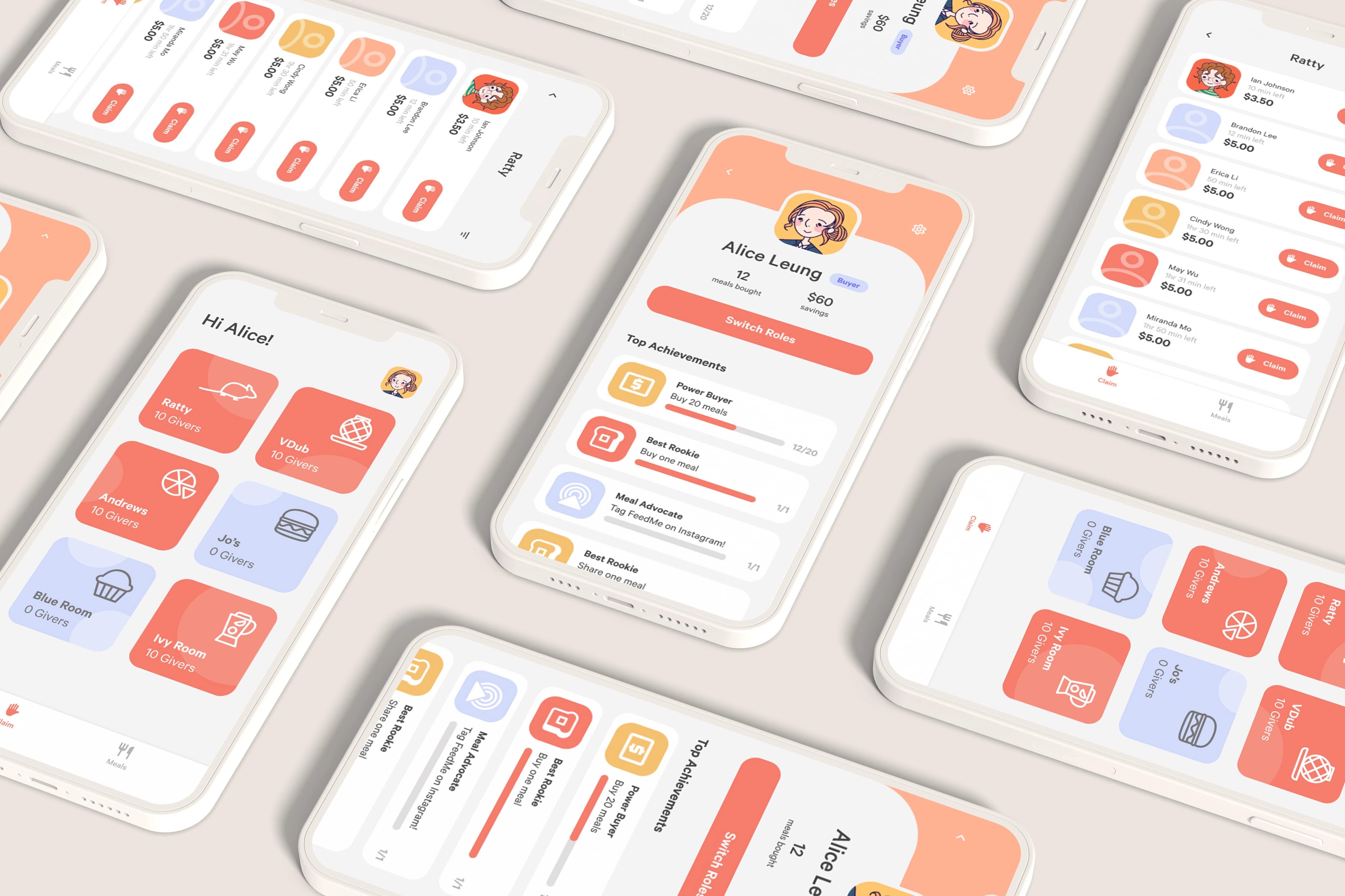
Every student can switch between being a Giver or Buyer. If a Giver runs out of credits, they can always buy it from their peers too.
Process
Personas
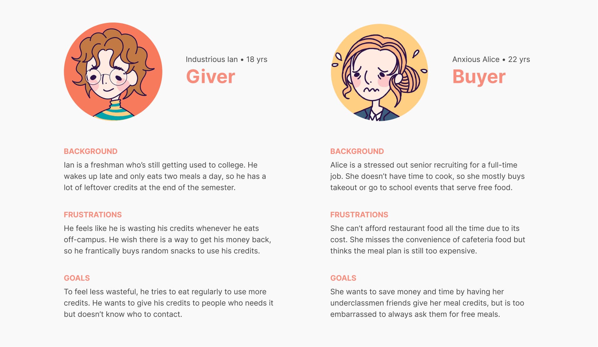
From the initial interviews, I identified two key student roles involved in the experience.
Wireframing and Testing
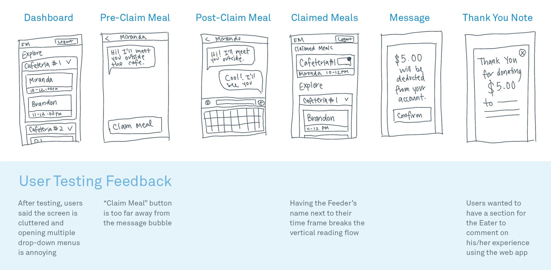
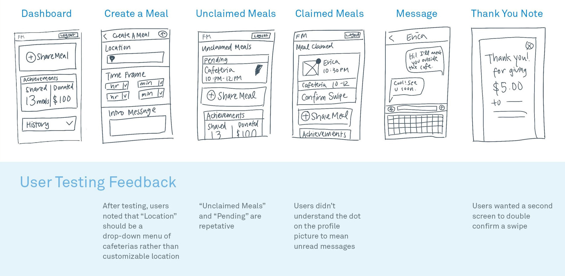
With the two users' goals in mind, I wireframed their user flow. These low-fidelity wireframes went through critiques and user testing with the original interviewees on the concept of sharing and claiming a meal. Generally, the feedback was to make information more hierarchal and condensed.
Giver's Journey
Buyer's Journey
Iteration 1
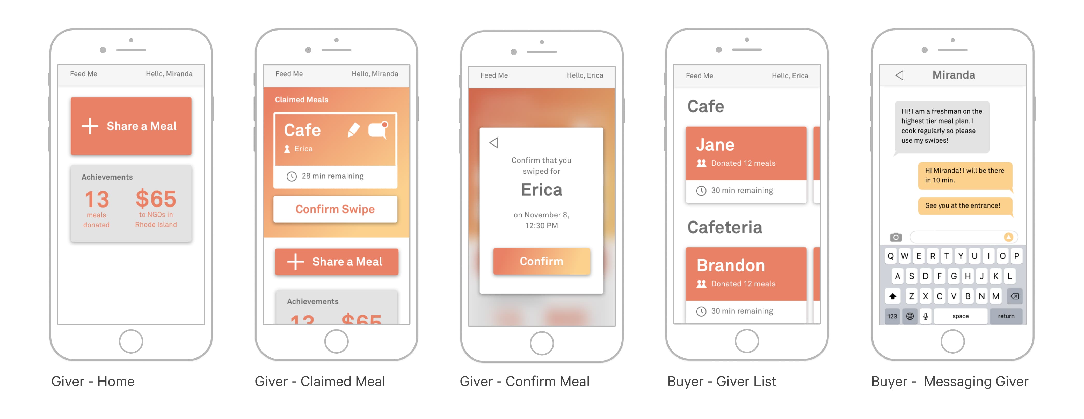
With only 24 hours left in the hackathon, I moved on to creating high-fidelity screens. Our main feature: Givers can sell a meal for $5, which is a lot less than $13, the average cost of a meal at an inexpensive restaurant in Rhode Island (Numbeo). Based on these designs, our web app prototype is powered by HTML/CSS/JavaScript front-end, Flask back-end, and PostgreSQL database. See our 1.0 deployed web app and Github!
✅ Goal 1: Incentivize Givers to share by allowing them to earn money
❌ Goal 2: Create a safe and easy way to share and claim meals
❌ Goal 3: Sustain user engagement and activity
Actionable Insights 1
However, I designed Feed Me in a 36-hours time crunch, so I continued to iterate on the designs to reach Goal 2 and 3. I presented my first iteration to three of the original interviewees and summarized their insights below:
👆 Unclear clickable elements
The edit and message icons don't look clickable, and the confirm button is less prominent than the share meal button.
🔒 Not secure
Users were confused as to whether everyone could register or only students from Brown.
⬇ Lack of engagement
Students forsee themselves only using the app towards the end of the semester, right before credits expire.
Iteration 2
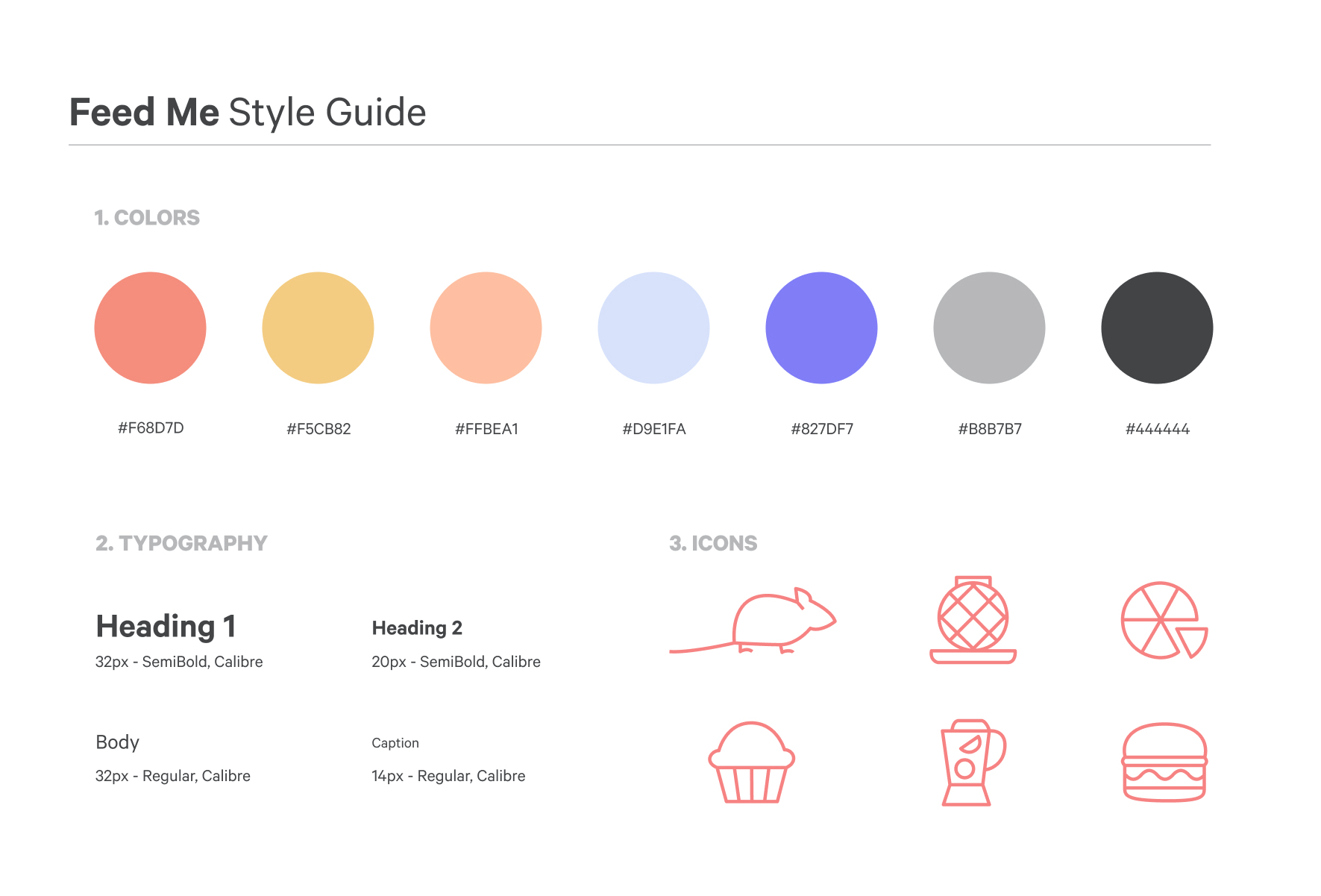
To resolve the first two actionable insights and reach Goal 2: create a safe and easy way to share and claim meals, I redesigned the UX and visual design to better define clickable elements and the hierarchy of information.
✅ Goal 1: Incentivize Givers to share by allowing them to earn money
✅ Goal 2: Create a safe and easy way to share and claim meals
❌ Goal 3: Sustain user engagement and activity
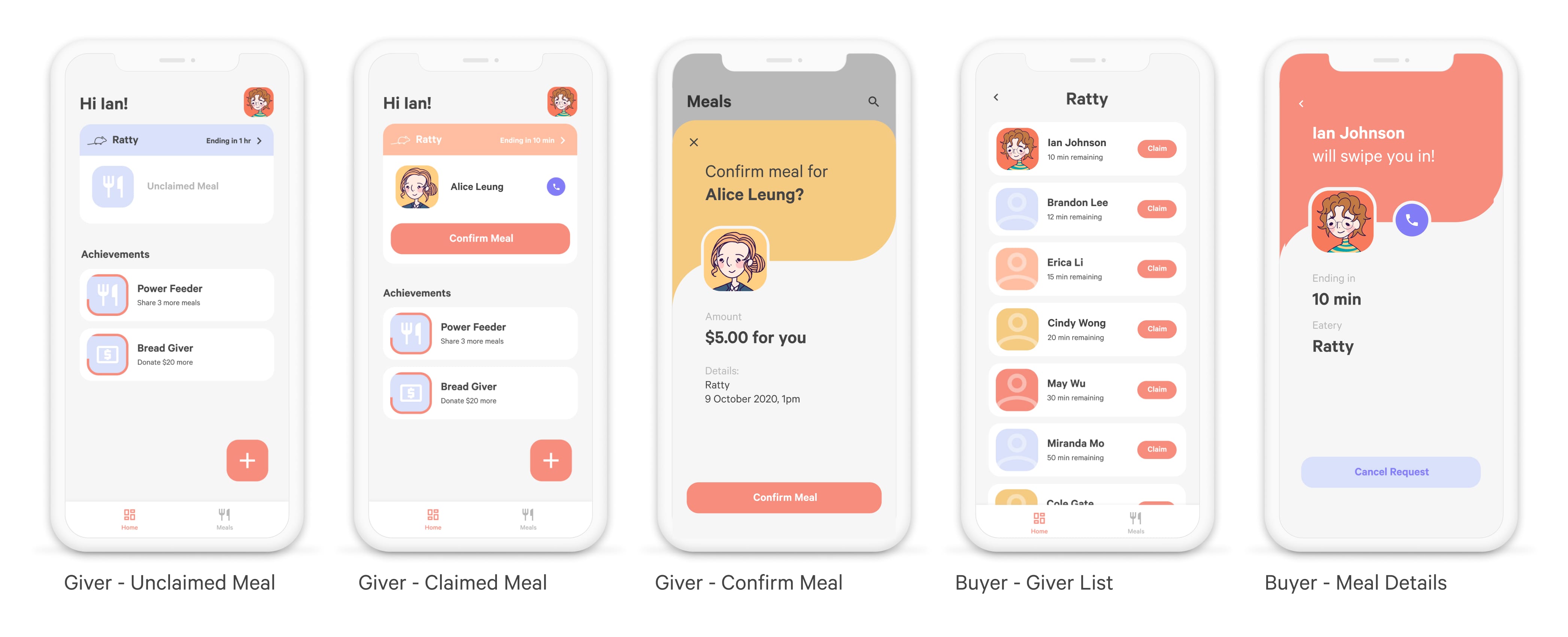
Student Authentication
I also introduced a .edu email verification process to ensure only students from the same schools are connected.
✅ Successful feature
Reaching Goal 3: Sustain User Engagement
To resolve the third actionable item of engagement, I brainstormed two new features that help students create positive impact as an incentive to use the app throughout the year:
Free meals for low-income students
The user can sell a free meal to low-income students. If a regular student claims it, they will still pay $5, but the proceeds will be donated to a local food pantry.
👎 Sensitive identity
User feedback noted that low-income students wouldn't want others to know they are low-income and would feel conscious of their class status by receiving a free meal.
❌ Unsuccessful feature
Donate $2 for every $5
Each meal is still $5 for all Buyers, but the Giver will automatically donate $2 to a local food pantry after each transaction.
👎 Not motivational
Even though there is still a $3 financial reward, users feel that the automatic donation is a tax rather than a voluntary contribution.
❌ Unsuccessful feature
Actionable Insights 2
User feedback shows that the altruistic features decrease engagement. In the end, I refocused on what's most important: users' pain points, and realized the hidden desire is that:
🗡 Students don't want the short end of the stick
Students will be willing to give out free credits because they don't want to the university to take advantage of their non-refundable credits.
Iteration 3
By focusing on people's priority to not let the college benefit from their forfeited credits, I created a new feature that meets Goal 3.
✅ Goal 1: Incentivize Givers to share by allowing them to earn money
✅ Goal 2: Create a safe and easy way to share and claim meals
✅ Goal 3: Sustain user engagement and activity
Customize the meal credit's price between $0 and $5
There is higher supply at the end of the semester because students are frantically getting rid of credits, lowering a credit's market price. Therefore, students will be inclined to sell earlier in the semester to maximize their profits when supply is low, generating user activity throughout the year.
👍 Prices Set by Supply and Demand
Users agree this is a fair feature and will incentivize them to sell throughout the year.
✅ Successful feature
What's Next?
We entered a competitive startup class with Feed Me!
Currently working on:
- Onboarding experience
- Achievement badges to create more incentive and fun
- Testing, testing, and more testing!
Learnings:
- Set the scope of the project! Focus on the essential 1-2 functionalities and use research to support why those are the priorities. Use a Product Requirement Description so everyone is on the same page.
- Get ready to get (almost) nowhere. I got stuck in designing features to encourage students to use the app throughout the semester. The solution is to refocus on users' pain points to come up with a suitable result.
- Holistic experience over aesthetics. All the time!
If you are interested in chatting more about my work, I would love to hear from you. Otherwise, thanks for reading!
