412 Food Rescue
Redistributing surplus food
UX Designer & Researcher
November 2019, redesigned October 2020
Lucy Qu, Jenny He, Milanca Wang
Overview
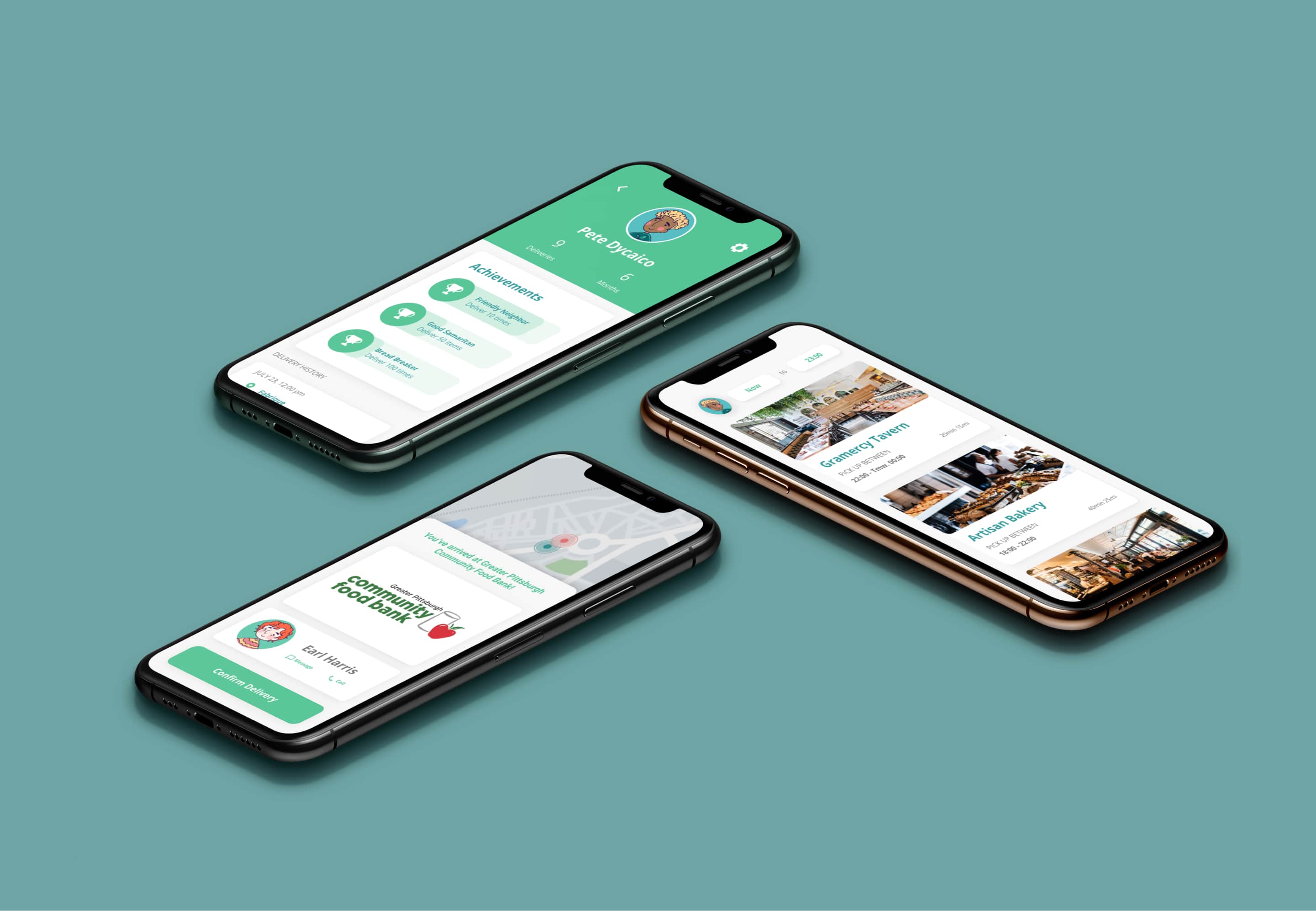
For our UIUX class final project, we designed an app for a startup based on only their objective. We chose 412 Food Rescue, an NGO that organizes volunteers to help deliver surplus food from restaurants to food pantries visited by people facing food insecurity.
To improve the interaction design and visual hierarchy, I redesigned most of the screens in October 2020. See the final designs here!
Problem
How do we unify the process of delivering surplus food between food providers, volunteers, community NGOs and maximize efficiency?
Solution
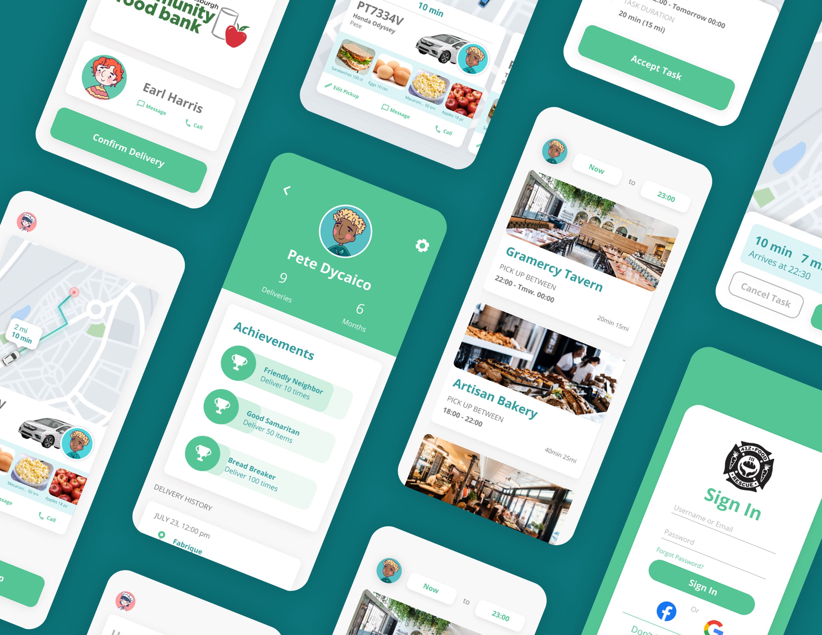
As a result, we created an app that makes it fun and easy to pick up and deliver food. Suppliers begin by posting pickups, and the algorithm will match what food they are giving out to NGOs that need it, creating a task for volunteers to do.
Research
I began the project by reviewing recent events and online forums to know more about Suppliers' struggles to get rid of excess stock and how NGO employees receive surplus food from retailers. We then conducted semi-structured interviews with Brown students who volunteer at a farm produce redistribution program to understand their habits and frustrations.
Pain Points
- Volunteers cannot do tasks that don't fit their schedules.
- Miscommunication happens when volunteers have to individually contact Suppliers/NGOs.
- Volunteers experience burn-out and disengagement when tasks are too long.
- Suppliers and NGOs feel that information is scattered- there isn't one place to see what Suppliers will give, when NGOs are open, and when volunteers are coming by to pick up/deliver food.
Synthesis
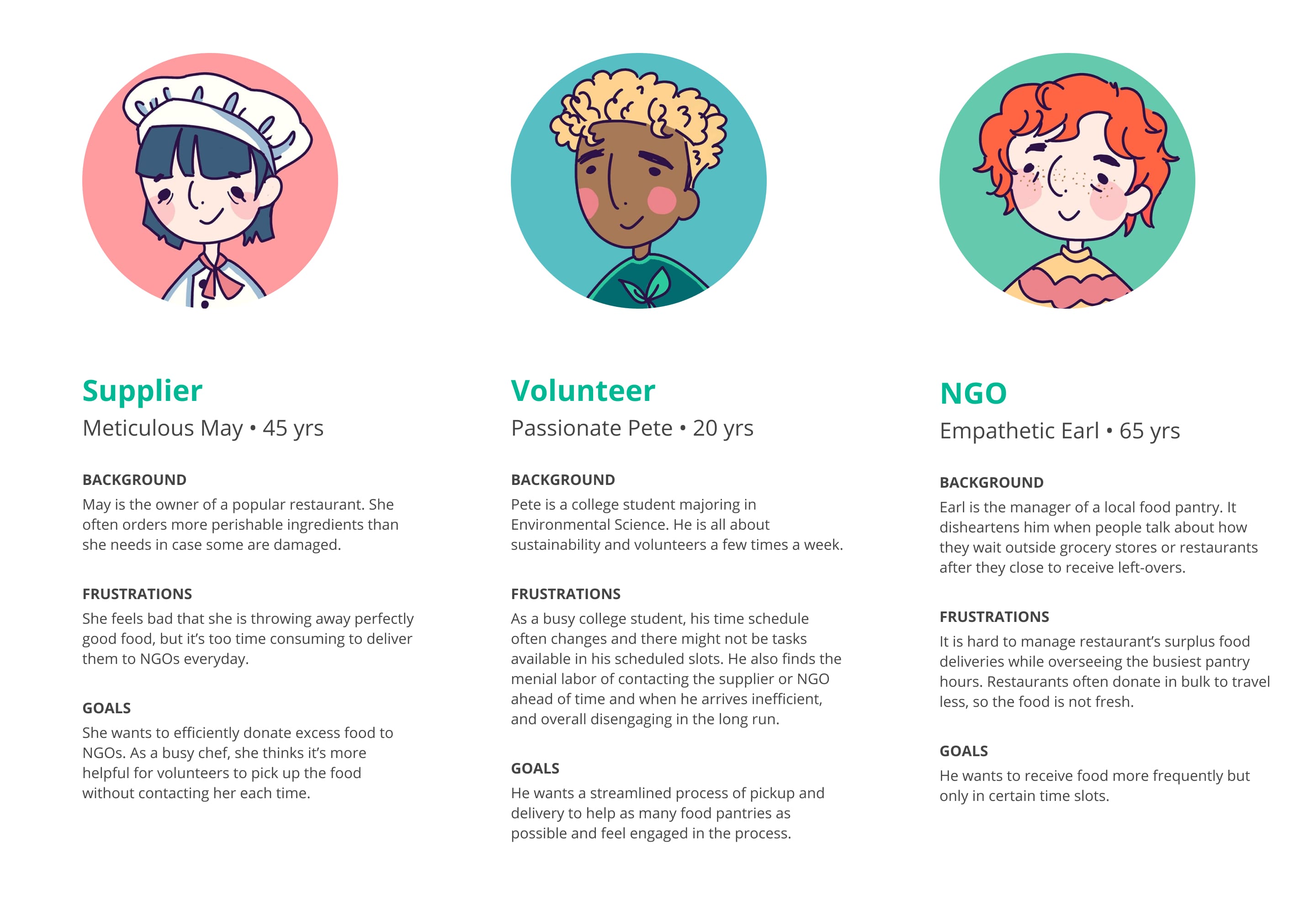
From our research, I created 3 personas that represent our user group. This helps us better visualize their frustrations and define the problem space.
Project Goals
- Make it easy for Suppliers to post a pickup and NGOs to show their availability for deliveries.
- Allow volunteers to choose tasks based on time
- Real-time update Suppliers/NGOs when Volunteer is coming
- Create achievement metrics to engage the volunteer
Ideation
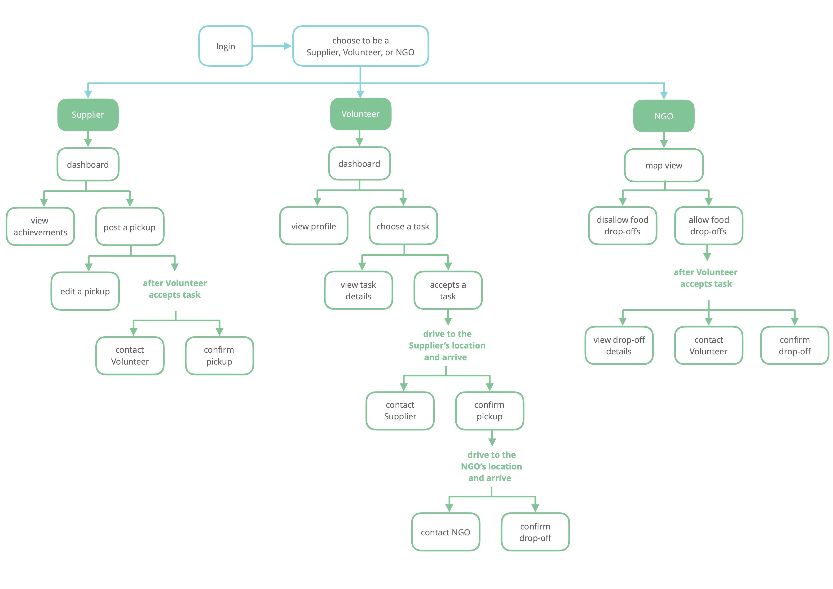
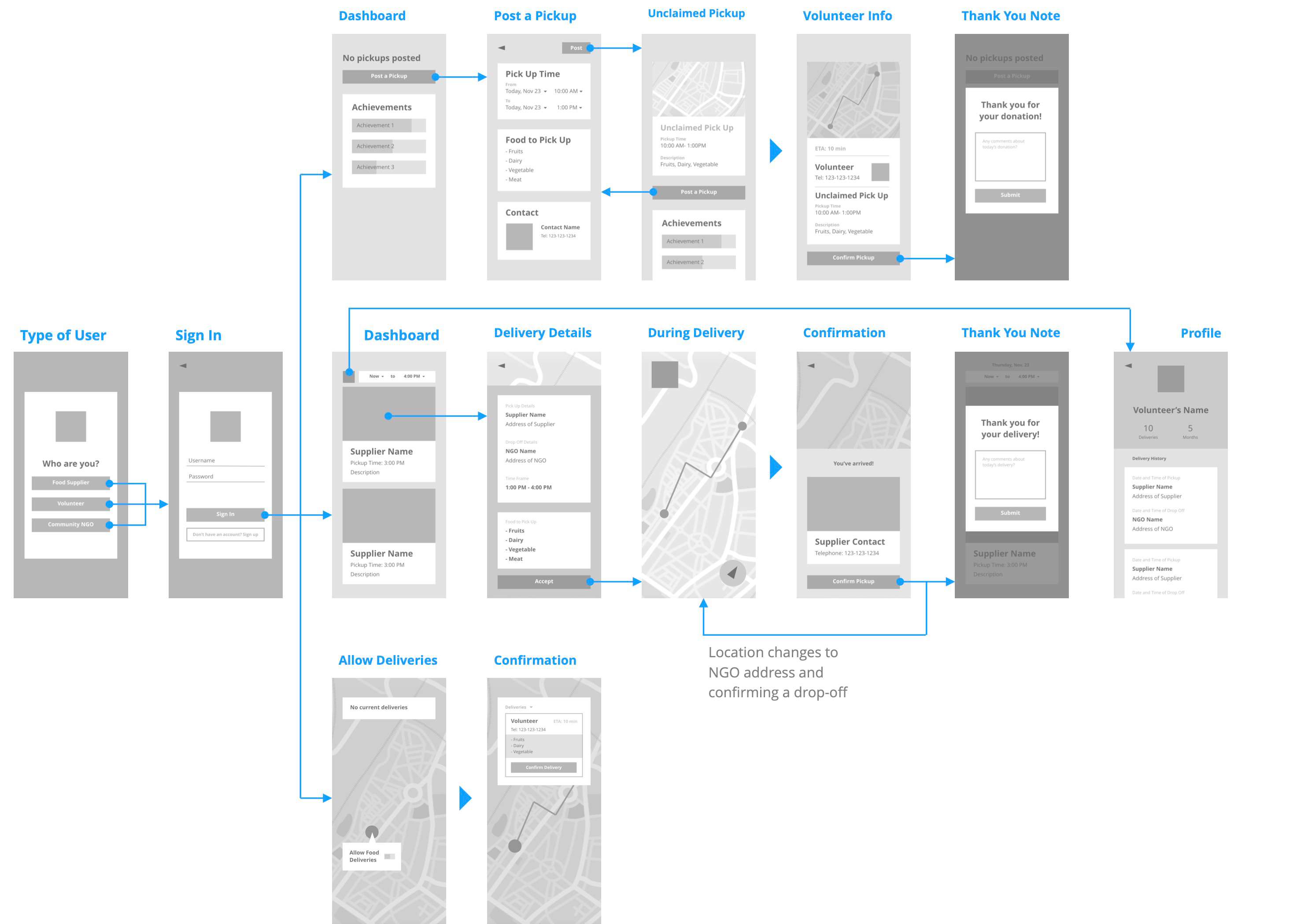
With the design requirements in mind, I mapped out the user flow to ideate on functionalities.
Wireframing and Initial Testing
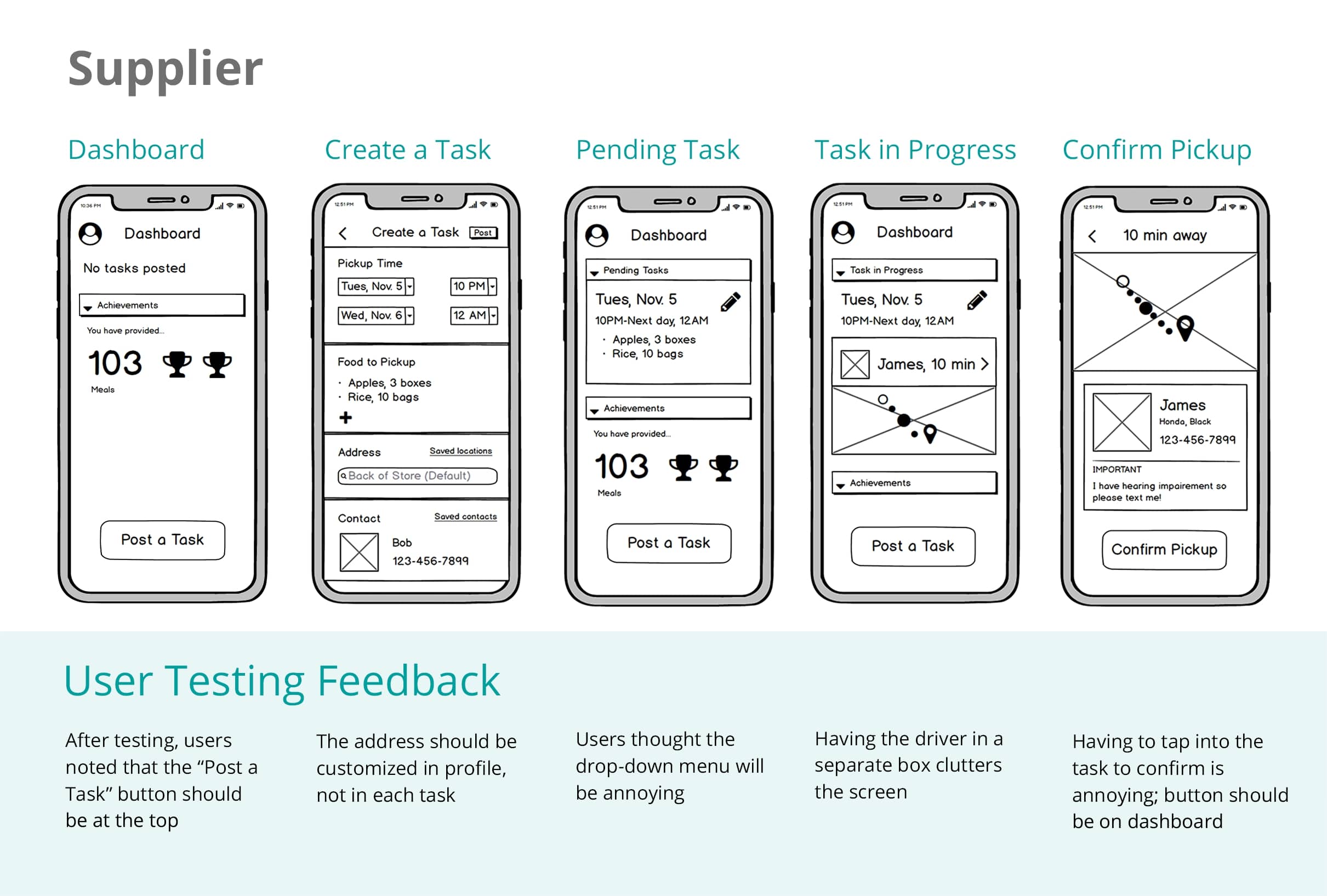
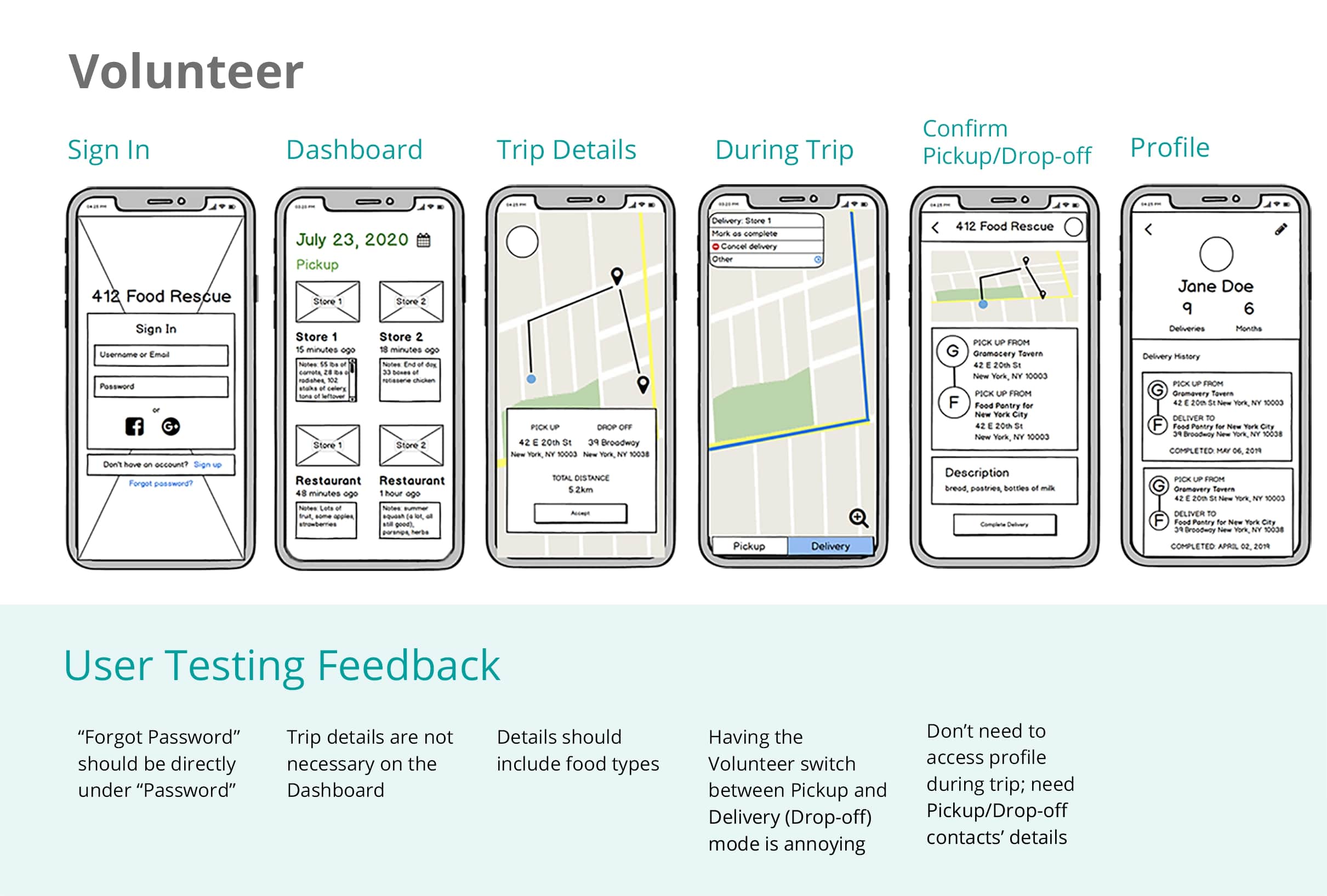
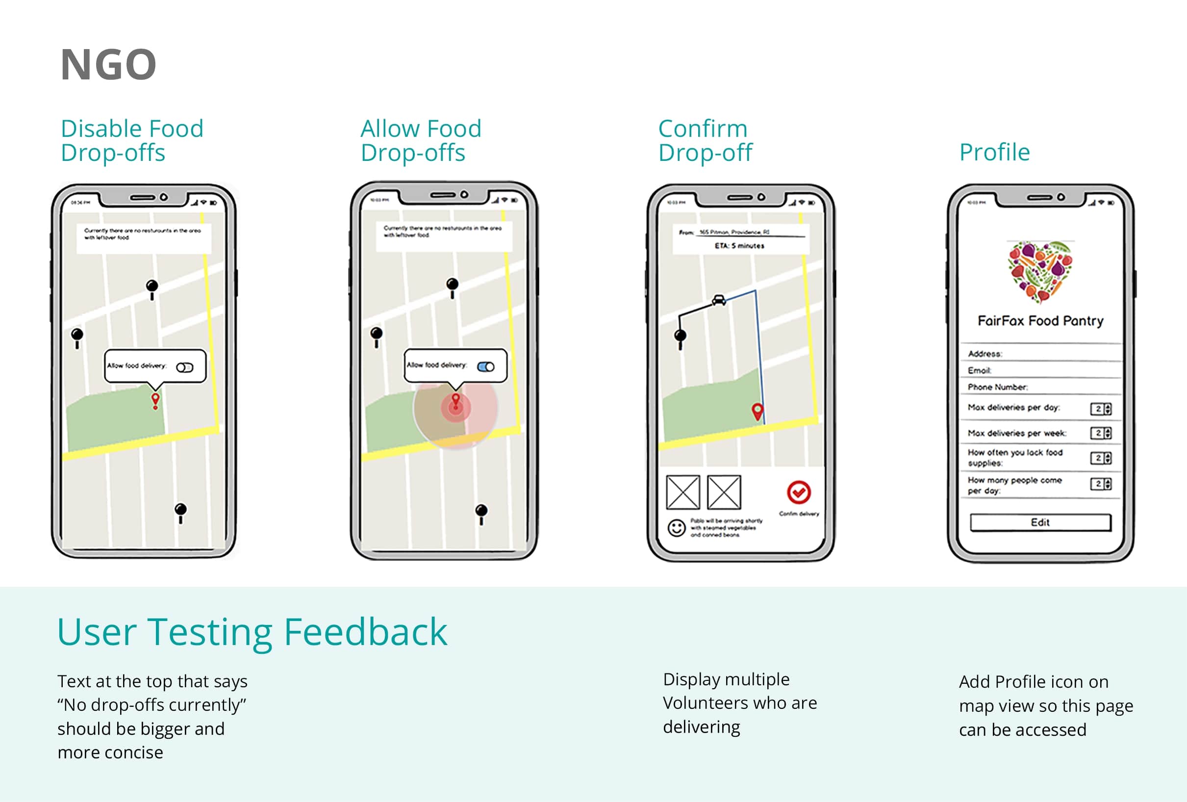
Base on the user flow, we created wireframes to test usability. We got users to read one of the persona cards, then gave them a task to do from the perspective of a Volunteer, Supplier, or NGO. The feedback from usability testing helped us identify key user scenarios for focused design iterations.
Branding
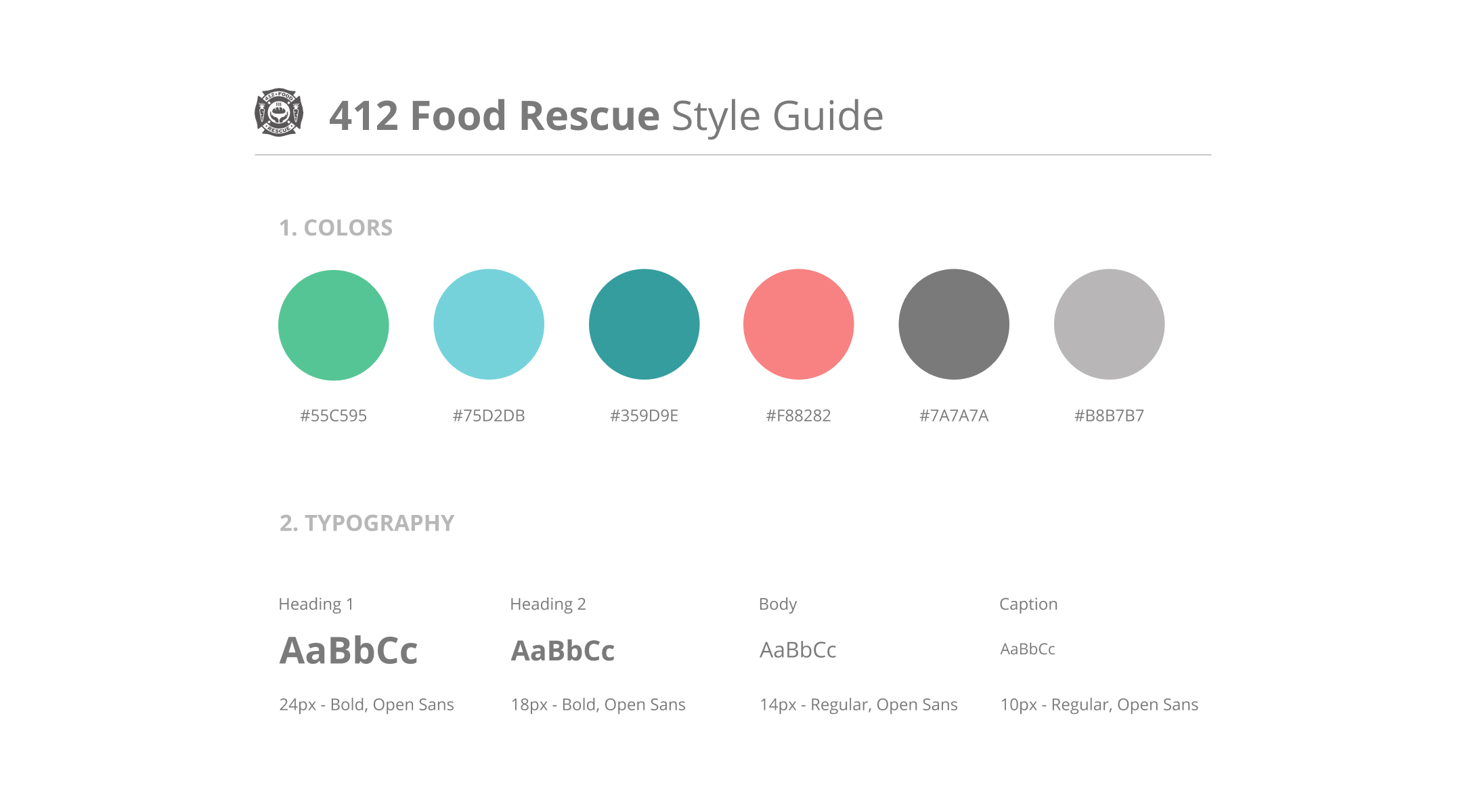
After solidifying our interactive flow, I took the lead in turning our app's values into our visual identity. We wanted to remind users of the social and environmental impact they are making. Therefore, the neo mint green theme creates a fresh look and goes hand in hand with environmental-friendliness.
Final Design
Like all school projects done in a time crunch, the Supplier and NGO experiences were not ideal. I took the time to redesign all the screens, focusing on intuitive and cohesive experiences. See my redesigns below!
Supplier User Journey
May posts a pickup.
As the day ends, May has some extra unused ingredients and decides to donate it. Pete, a volunteer, claims her pickup, and May can see how far away he is. Once Pete picks up the order, May's posting is complete and she can leave a thank you note for Pete.
Volunteer User Journey
Pete picks and completes a task in his preferred time.
Pete decides to do a task after his last class at 7pm. He uses the time filter and picks a short task that is between 7pm and 9pm. He drives to May's restaurant and confirms the pickup.
NGO User Journey
Earl receives a delivery.
After serving dinner, Earl has time to manage and receive donations from restaurants. He toggles the switch to open the NGO for receiving deliveries. He can quickly see when Pete is coming and what he is delivering. Once Earl receives the delivery and Pete confirms it, Earl leaves Pete a thank you note.
Volunteer User Journey
Woohoo! Pete wins achievements.
When Pete completes the task, he receives a thank you note and gains achievements. He can check his accomplishments in his profile.
Try out the final prototype!
User Testing, again!
Lastly, we submitted our volunteer hi-fi prototype to UserTesting.com.
We hypothesize that the one-directional design of this app makes navigation user-friendly and allows users to complete the tasks with few distractions. Three UX researchers (alias Abby, Bryan, Caleb) tested our interface, and we quantitatively and qualitatively analyzed their responses.

Conclusion
Our hypothesis was supported because our users successfully used the app to make a delivery in 2:45 minutes. Abby mentioned that seeing her achievements at the end makes her feel an “adrenaline rush,” and Brian noted that his accomplishments keep him engaged.
What's Next?
For future UX improvements, I would look into:
1. Accessibility for disabilities
- For color-blind users, revamp our app's red-green color scheme so elements are more distinguishable.
- For Supplier/NGO contacts with visual impairments, include a note that tells the volunteer to call the Supplier/NGO employer rather than text.
- For volunteers with hearing impairments, include a note that tells the Supplier/NGO employer to text rather than call.
2. Gamify achievements to increase motivation
- Make Achievements a plant that grows with donations, so Suppliers and Volunteers can visually see their contributions in helping the planet go green.
3. Onboarding pages for elderly NGO workers
- Teach older workers how to scroll in a carousel to check what food the Volunteer is bringing.
If you are interested in chatting more about my work, I would love to hear from you. Otherwise, thanks for reading!